SALES / SUPPORT : +1-877-525-5646 |
Login
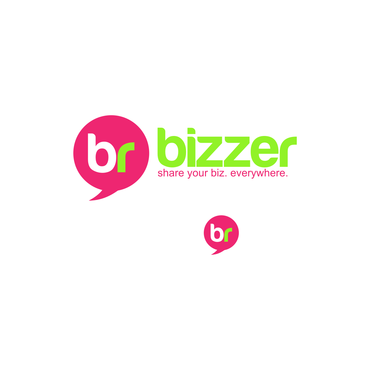
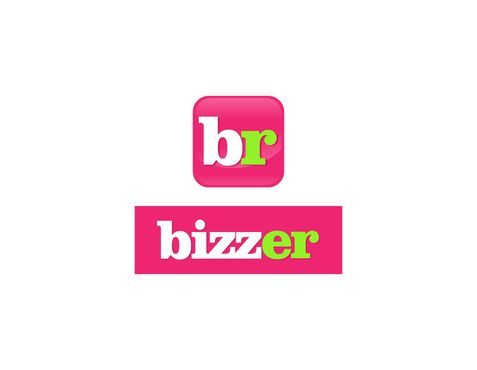
"bizzer" and "br" text, wanna add something? We are all eyes!
|
Contest Holder
dragoonslair
?
Last Logged in : 3050days16hrs ago |
Concepts Submitted
45 |
Prize Money
200
|
Winner(s) | A Logo, Monogram, or Icon |
|
Live Project
Deciding
Project Finalized

Bizzer Mobile App Logo
"bizzer" and "br" text, wanna add something? We are all eyes!
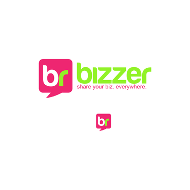
Share your Biz. Everywhere.
Yes
Hi Designers! A simple task, we have a great android app on Google Play: https://play.google.com/store/apps/details?id=com.appsbuilder638877&hl=it
Try it and look at our logo. We have a textual "bizzer" and a icon ("br") written in Averia San Libre. Our colors are white, green and a fluorescent pink.
Now.
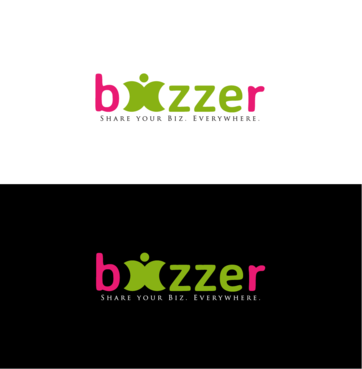
We are interested in a little restyling to have this logo more "schematic". Averia is a good starting point but we don't like that our logo is so unorganized with some "standard" elements.
We like our colors, they are unusual for apps and we like this unconventionality.
So you can adjust our logo and send us your view or try to imagine a new one. We would like to have a full logo (textual, "bizzer") and an icon one (small, just two letters "br").
Communications and Media
Logo Type
![]()
Web 2.0
![]()
Modern
Youthful
Professional
white, fluo pink and green. Don't you like? Try our app and choose something different!
3
Easy way: try to standardize our logo (we like to have custom shapes and not a "font" logo). Add few elements thinking that this will be used on a mobile apps and win the prize!
Right way: Download our app: Bizzer is a social Utility to help you share your contact info throught sms with a custom shortern url to track who click you business card and more. Understand our values (green, no paper, technoloy and analytics) and...win the prize!


Comments