SALES / SUPPORT : +1-877-525-5646   |  


ESP

esp or esp IT (need lower case esp please).

Contest Holder ALesp ?

Last Logged in : 3128days17hrs ago

Concepts Submitted

522

Guaranteed Prize
550
Winner(s)

1

A Logo, Monogram, or Icon veildAll design entries are veiled from other designers till the end of the contest. Featured Featured Contest
tick_gray

Live Project

tick_gray

Deciding

tick_blue

Project Finalized


Project: ESP
Contest Launched: Feb 14, 2012
Selected: 1 winning design from 522 concepts
Winning Design by: tomitod999
Close Date: Mar 02, 2012


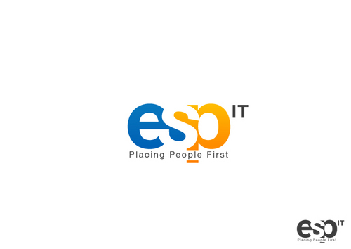
ESP - Information Technology


Awarded as a winner
Project Report    

Sort by:


#507

#506

#504

#501

#500

#499

#498

#497

#496

#493

#491

#490

#489

#488

#487

#473


Creative Brief


ESP

esp or esp IT (need lower case esp please).

Placing People First

Yes

ESP is an IT staffing firm passionate about helping IT candidates advance their careers and helping our clients find their greatest asset: new employees. We provide consulting, contract-to-hire, and permanent placements in the IT market. Our target area is the Minnesota IT market, clients with small-mid- sized IT departments and IT professionals with 3-15 years’ IT experience (although we also work with higher level IT professionals and larger companies).

ESP was founded in 1968 and stood for electronic systems personnel; the name is long gone due to the changed terminology now used for IT; however for brand identity we have kept ‘esp’ over the years (always in lower case in our logo).

Information Technology

Logo Type
Logo Type

Abstract Mark
Abstract Mark

Web 2.0
Web 2.0


Cutting-Edge
Unique/Creative
Clean/Simple
Modern
Industry Oriented
High Tech
Retro

We’d like to possibly keep our current shade of blue, but would be open to seeing new blues and/or multi-color designs. (logo/blue on www.esp.com)

3

Note: We'd like the tag line to be easy to remove for some purposes.
Please keep ESP in lowercase.
Visit our website www.esp.com to understand who we are.
The letters ESP could be logo on their own, but we are open to an abstract mark if it will enhance the concept of the logo.
Please see our last two logos. The blocks in our current logo make it difficult to work into other designs (branded materials, our email signatures, etc.) We are looking for something simpler, and more up to date. We like that the current letters have some interest, but want to be sure it is clear that the letters are ESP.

Related Contests


Business & Tech. incubator, Accelerator, Technology and training Lab R&D (apps & tech. development).
$200
Prize Money
24
Concepts
SteadyStart
$210
Prize Money
67
Concepts
IT Company Logo
$200
Prize Money
173
Concepts
Logo for exonik compagny
$300
Prize Money
119
Concepts

Discussion


Comments

  • March 02, 2012 7:55 AM
    ALesp ALesp
      Project Holder
    Thanks everyone for the great designs you submitted. There were a lot of logos that I liked, and it was tough to pick a winner. Thank you for your work!

    Like Icon 0   DislikeIcon 0
  • February 29, 2012 11:47 PM
    fadzliezsix fadzliezsix
     
    Can open this contest again? i will do my best according your brief

    Like Icon 0   DislikeIcon 0
  • February 16, 2012 3:36 PM
    ALesp ALesp
      Project Holder
    Thanks for more designs! As a heads up, we'd like to get away from the tan as it seems to us to look dated. We'd like some new colors (or new additions to blue) that will help our logo look up-to-date. thanks!

    Like Icon 0   DislikeIcon 0
  • February 16, 2012 9:17 AM
    ALesp ALesp
      Project Holder
    Thanks again for all the great designs! A few general notes: Ties—I like the design concept, but ties aren’t worn much in our industry (except for interviews) so I don’t think it’s the direction we’d want to go. People—I've seen a lot of designs with people, so would like to see some without the people too. I like the integration of the people into the letters.Some of the people seem to look too much like a cross. I think the people with the arms raised look a little bit more like an athletic logo than an IT logo. While relationships are important to us, we are staffing firm. ESP--we prefer these in lowercase. While it has been interesting to see some variations in uppercase, we really prefer lowercase. I will do my best to comment on individual designs, but feel free to contact me directly if you would like feedback on your design. Colors--seen a lot of orange with the blue. Would love to see some other colors.we are also open to designs with more colors.

    Like Icon 0   DislikeIcon 0
  • February 14, 2012 2:26 PM
    ALesp ALesp
      Project Holder
    It's fun to see so many designs already. Some comments general and specific: I like seeing the designs with people. I wonder if it could be interesting/possible to see the people be (abstractly) the letters "I"& "T"? I think I like draft #3 best of these, but thought they all had some interesting elements. draft #10, I like some of the concepts and colors, but would want the "S" to be closer to a regular s. I liked that the s was a person, and it would be cool to maintain that, but I felt the "s" got lost as is. draft #6, I like the design, but would prefer to not have extra emphasis on the "s" draft #7, I like the use of color and lines, but prefer a lowercase "e” if possible.

    Like Icon 0   DislikeIcon 0