SALES / SUPPORT : +1-877-525-5646 |
Login
Incompass
|
Contest Holder
christophersparker
?
Last Logged in : 2635days10hrs ago |
Concepts Submitted
155 |
Guaranteed Prize
400
|
Winner(s) | A Logo, Monogram, or Icon |
|
Live Project
Deciding
Project Finalized

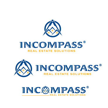
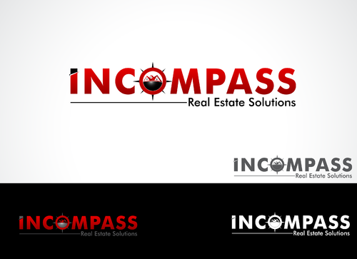
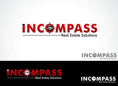
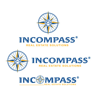
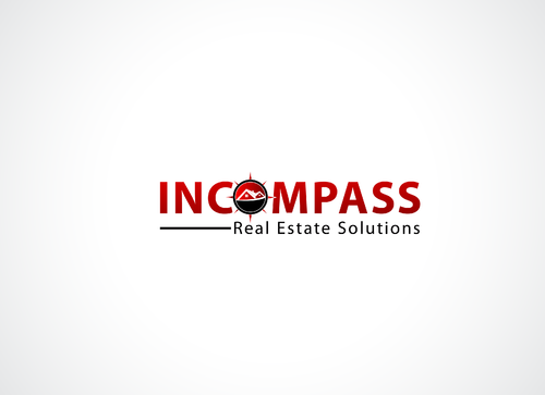
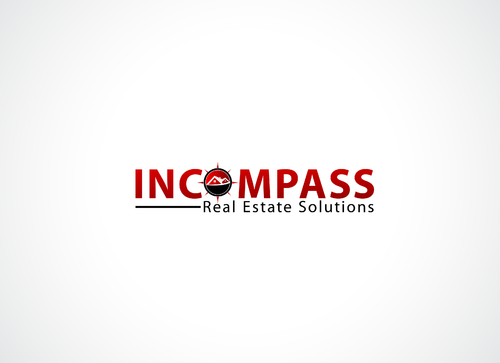
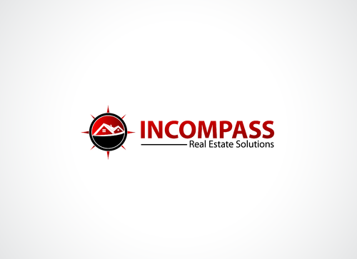
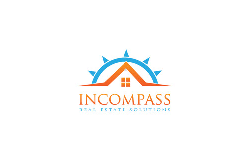
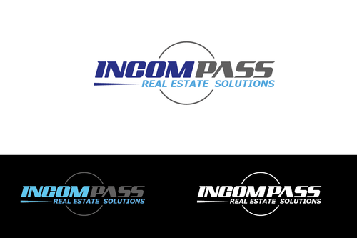
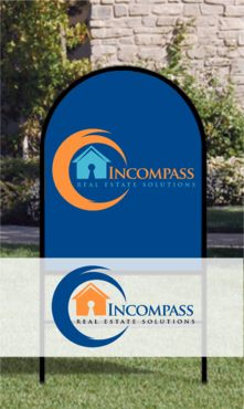
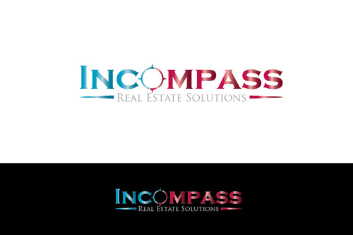
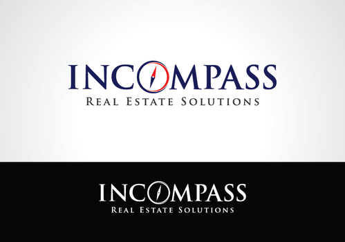
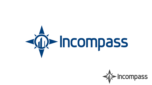
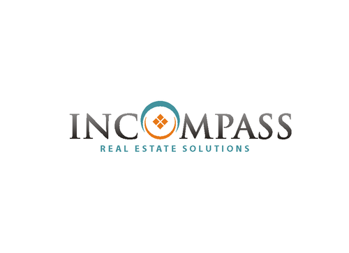
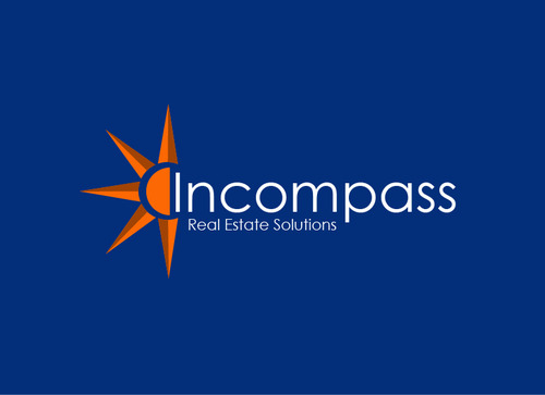
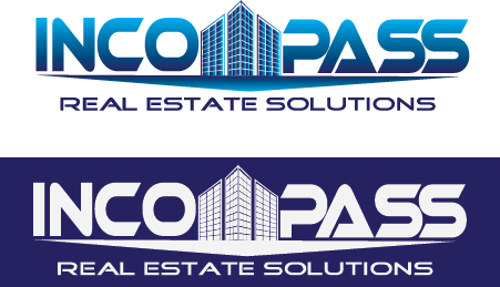
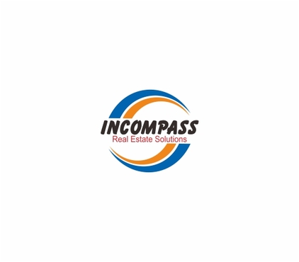
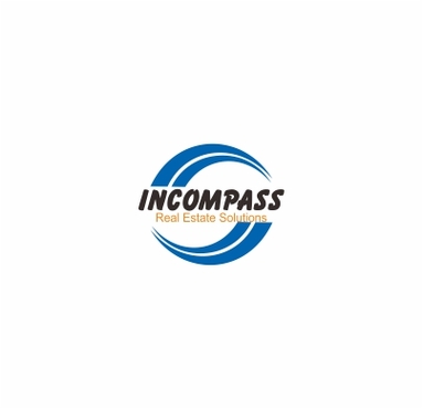
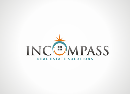
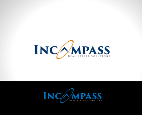
Incompass Real Estate Solutions
Incompass
Real Estate Solutions
Yes
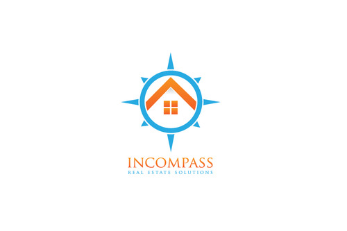
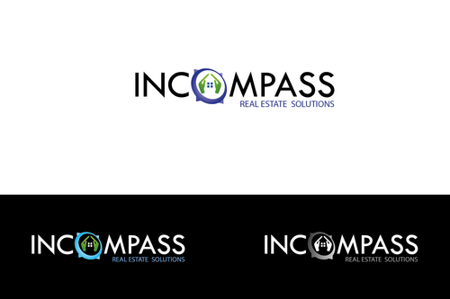
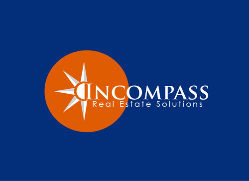
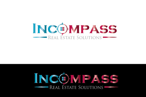
Incompass Real Estate Solutions is a parent company of Real Estate, Mortgage, Title and Insurance Company's. The name Incompass was derived from us Encompassing (to form a circle or surround) Real Estate Solutions for our Clients needs. Compass is also a navigation tool as we navigated them through the real estate buying and selling process. Logo design needs to be trademark-able.
Real Estate
not sure
Logo will primarily be used on a 30x24 inch Dome shaped real estate sign. Logo needs to be distinguishable from about 10-20 feet.


Comments
Project Holder
Project Holder
Project Holder
Project Holder
Project Holder
Project Holder
Project Holder