SALES / SUPPORT : +1-877-525-5646 |
Login
CASTILLOS GROUP
|
Contest Holder
icastillo
?
Last Logged in : 1602days20hrs ago |
Concepts Submitted
165 |
Prize Money
199
|
Winner(s) | A Logo, Monogram, or Icon |
|
Live Project
Deciding
Project Finalized

Logo for a Realty Brand
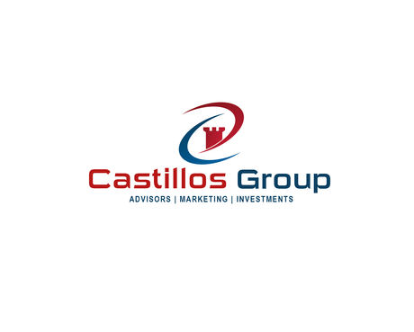
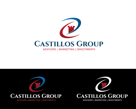
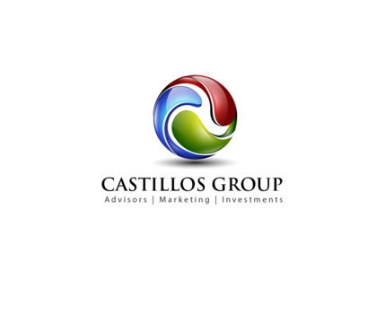
CASTILLOS GROUP
Advisors | Marketing | Investments
No
We are a team dedicated professionals that provides consulting services to buyers, sellers and investors to help them acquire or market real estate assets.
Real Estate
Logo Type
![]()
Abstract Mark
![]()
Initials
![]()
Illustrative
![]()
Modern
Cutting-edge
Sophisticated
Simple
Professional
Red, Dark aqua blue
2
Like the idea of a symbol like yin & yang incorporated in the logo, but modernized.


Comments
Project Holder
Project Holder
Project Holder
Project Holder
Project Holder