SALES / SUPPORT : +1-877-525-5646 |
Login
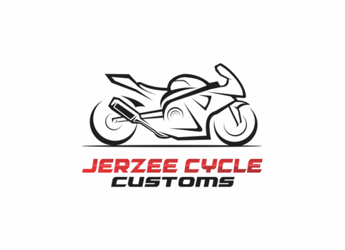
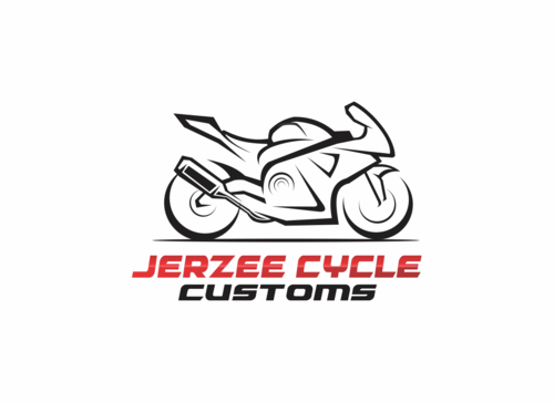
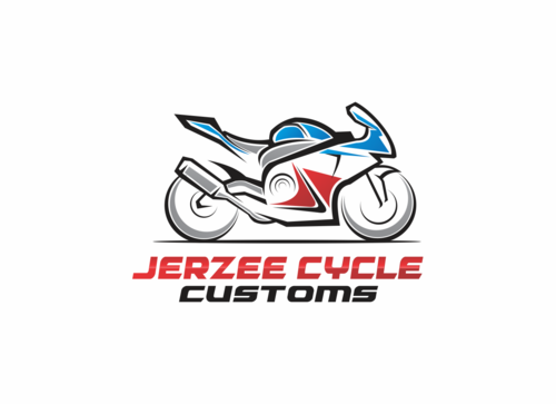
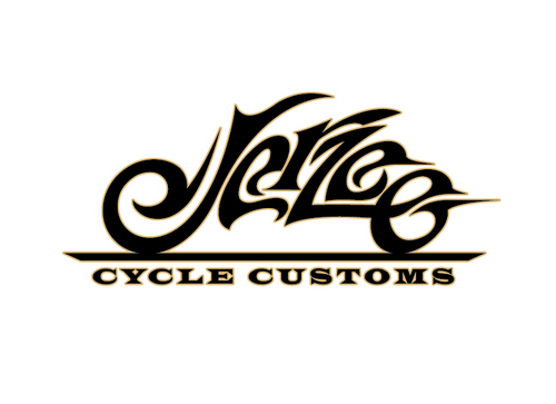
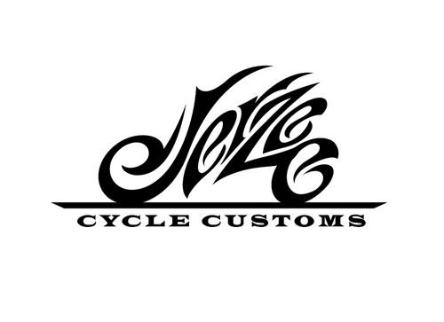
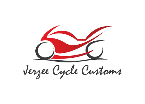
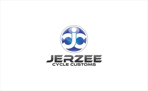
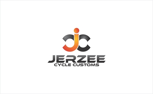
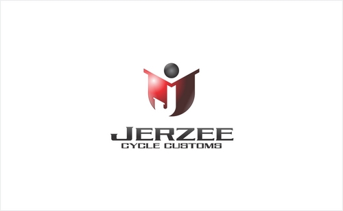
Jerzee Cycle Customs
|
Contest Holder
jerzeecycle
?
Last Logged in : 3545days12hrs ago |
Concepts Submitted
57 |
Prize Money
300
|
Winner(s) | A Logo, Monogram, or Icon |
|
Live Project
Deciding
Project Finalized

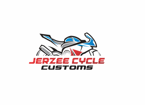
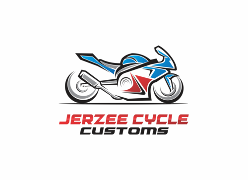
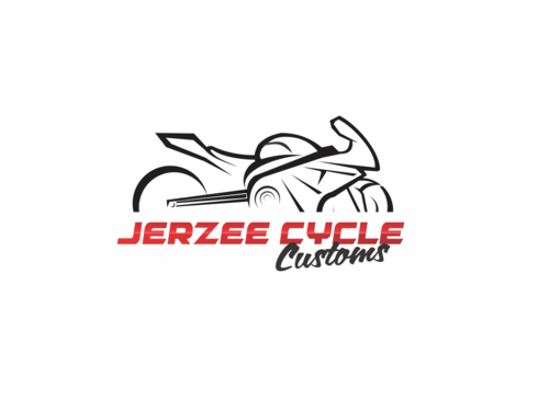
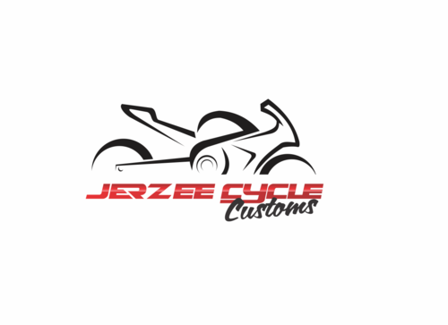
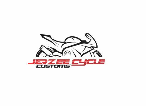
Logo for custom motorcycle shop.
Jerzee Cycle Customs
No
A logo thats eye catching, simple, and stands out from other motorcycle businesses and has a focus on custom sport bikes.
Automotive
Masculine
Modern
Cutting-edge
Youthful
Simple
not sure


Comments
Project Holder
Project Holder
Project Holder
Project Holder
Project Holder
Project Holder
Project Holder