SALES / SUPPORT : +1-877-525-5646 |
Login
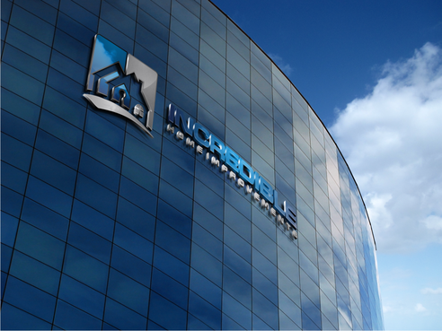
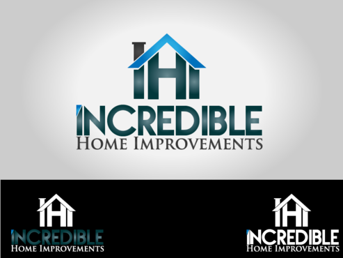
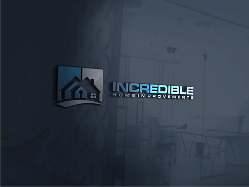
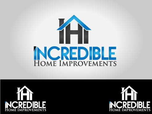
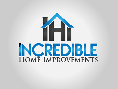
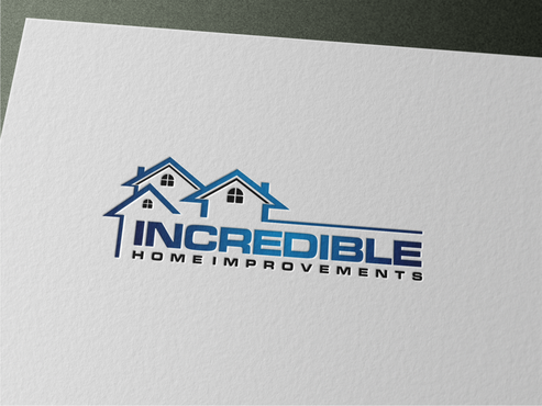
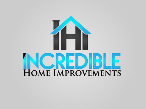
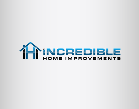
Incredible Home Improvements
|
Contest Holder
Incredible1
?
Last Logged in : 1546days16hrs ago |
Concepts Submitted
234 |
Prize Money
250
|
Winner(s) | A Logo, Monogram, or Icon |
|
Live Project
Deciding
Project Finalized

Redesign Logo for Remodeling Company
Incredible Home Improvements
No
http://incrediblehomeimprovements.com/About.html
Construction
Symbolic
![]()
Initials
![]()
Illustrative
![]()
Sophisticated
Professional
Black, Blue, charcoal grey, & brown if possible
not sure
Would like a logo that is Bold & Memorable, Sophisticated and "high-end". Perhaps a little Artistic to show creativity.


Comments
Project Holder
Project Holder
Project Holder
Project Holder
Project Holder
Project Holder
Project Holder
Project Holder
Project Holder