SALES / SUPPORT : +1-877-525-5646   |  


Tri-Fold Brochure & Flyer

Nittany Co-Op

Contest Holder NittanyCooperative ?

Last Logged in : 4805days5hrs ago

Concepts Submitted

20

Guaranteed Prize
350
Winner(s)

1

Marketing collateral veildAll design entries can be viewed by other designers.
tick_gray

Live Project

tick_gray

Deciding

tick_blue

Project Finalized


Project: Tri-Fold Brochure & Flyer
Industry: Logo
Contest Launched: Jan 26, 2011
Selected: 1 winning design from 20 concepts
Winning Design by: rakhareswara
Close Date: Feb 02, 2011


Tri-Fold Brochure & Flyer -


Awarded as a winner
Project Report    

Sort by:


#11

#9

#8

#5

#4

#2

#14

#13

#10

#7

#3

#1


Creative Brief


Tri-Fold Brochure & Flyer

Nittany Co-Op

Non-profit, faith-based, and other local community organizations. We are initiating a New Member Campaign so these would be used to generate interest and awareness about joining the Co-Op. Emphasizing the benefits of our services and how it would help their organizations.

Be creative but maintain a simple and sophisticated look. Blue and charcoal is preferred coloring but not absolute. Community based pictures and ones symbolizing "Membership is the Heart" are preferred. Trying to display a trusted, local, and service oriented image. Please refer to our website at www.nittanyco-op.org to get a better feel.


Discussion


Comments

  • February 02, 2011 5:26 PM
    anthronx anthronx
     
    congratz rakhareswara...

    Like Icon 0   DislikeIcon 0
  • February 01, 2011 9:10 AM
    NittanyCooperative NittanyCooperative
      Project Holder
    I would prefer not to use world or country images as we are trying to have a "local" perception.

    Like Icon 0   DislikeIcon 0
  • February 01, 2011 8:52 AM
    NittanyCooperative NittanyCooperative
      Project Holder
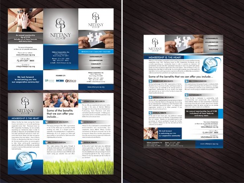
    Draft #9: The overall layout is good however I prefer to keep the logo intact instead splitting the "Nittany Co-Op" to the side. When as is, it provides an abstract tree image which goes along with our sustainability focus. Also, I prefer the logo being more of the focal point instead of the tagline "Membership is the Heart". Thanks

    Like Icon 0   DislikeIcon 0
  • January 31, 2011 8:56 AM
    NittanyCooperative NittanyCooperative
      Project Holder
    Deck86 and Durrani: Thanks for your submissions. If you are able to create drafts without the text appearing so heavy, I would appreciate it. Having the front and back flaps displaying more contact info is also preferred.

    Like Icon 0   DislikeIcon 0
  • January 31, 2011 8:52 AM
    NittanyCooperative NittanyCooperative
      Project Holder
    Can other photos such as Istock examples 11199468 (Membership Heart) and 12580925 (Community puzzle) be used as opposed to the website photos? These are just suggestions and if other photos displaying similar meaning can be found, great. Thanks,

    Like Icon 0   DislikeIcon 0
  • January 31, 2011 8:50 AM
    NittanyCooperative NittanyCooperative
      Project Holder
    Draft #6: I like the creativity and the eye appealing layout. I definitely prefer NOT having the text be the focal point and become too overbearing for the audience. Are you able to use other pictures as mentioned in the following comments?

    Like Icon 0   DislikeIcon 0