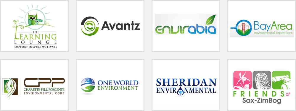
Selected Logos / Category: Charity & Nonprofits / Environmental Care

If you happen to own a business that's eco-friendly, you need to understand that choosing a proper visual brand identity is what's going to separate you from competing businesses. As the earth continues to get stripped off of its natural resources, many businesses have decided to opt for more eco-friendly options.
Learn how to make the eco-friendly aspect of your company stand out by understanding how the following elements can be implemented go into a good "green logo".
Color is one of those crucial aspects of a logo design which can work wonders for the success of your visual identity. Every color delivers a message and speaks to the target audience. However, though they have information, a common mistake business owners tend to make is to go with too many colors. This keeps the design from being distinct and memorable. So for your logo, try to stick to a few colors, preferably two to three because this works well for environmental visual identities.
You're obviously thinking what better color to start with than green. While this is true, under certain circumstances, green can represent greed but it all depends on how certain symbols are tied to the logo.
Simplicity is the best choice when it comes to these designs. Take special care not to choose identical colors schemes which are used by your competitors.
Consider blue, the most liked tone in the color spectrum. Certain shades of blue evoke feelings of reliability, trustworthiness, serenity, cleanliness and calmness. These emotions are considered highly desirable in this industry. Using blues can also give you a distinct edge in the market, as few businesses use it in their brand identities.
Looking for more earth-friendly tones? Brown is perfect because it is a color which is known for simplicity and seriousness. It is also associated with earth and nature. White is a great choice as well because it relates to peacefulness and purity. Yellow, when used carefully, is a natural-looking tone that evokes renewal, energy and cheerfulness.
The best environmental visual identities incorporate prominent geometrical shapes. Think of the Discovery Channel's design, it is a straightforward green circle accompanied by simple text. Circles really are a natural choice for sustainable brand logos because they have no beginning or ending.
If you want your target audience to know that you are a business that believes in the process of natural recycling, this is exactly what you want to reinforce with your design. The spherical shape also represents the sun or earth so circles are perfect for displaying a sense of wholesomeness and completeness
Rectangles and squares stand out when it comes to relaying a sense of order, reliability and sturdiness. They are perceived as earthbound symbols. When it comes to sustainable brands, rectangles and squares are usually a good second choice simply because -circles have the tendency to seem boring and overused. You can also display a livelier side of your business by tilting these square and rectangular shapes diagonally.
Triangles depict motion, power and spirituality, as well as balance. Many companies go with the typical "recycling" triangular logo, with the arrows moving along the borders.
Spirals as well as swirls can work very well in environmental brand images as they're associated with life, growth and transformation. They can also be used to represent the cycles of life which is ideal imagery for a green company image.
Fonts form a vital part of the visual identity design process. When it comes to environmental care graphics, you should go with an easily recognizable typeface. Take the World Wildlife Federation (WWF) logo for instance. This logo makes good use of shapes a circular stylized panda which also symbolizes the "endangered species" factor. Observe how the black and white color tone displays purity and simplicity, with no extra frills. It also has a clean and basic font that spells out "WWF". This logo wouldn't have been as effective, if a showy or script font had been incorporated
Generally speaking, green logo designs look best with clean fonts. A serif typeface conveys tradition and respectability while a sans-serif typeface is ideally used to relay objectivity and cleanliness. Conversely, a modern font may be used to project a company's strong or progressive values.
It's good to know that display fonts can work quite well in a green logo as well. A well-known cosmetics company, Lush, incorporates a distinct font accompanied by a green and yellow design. The white text inside the oval certainly makes a unique statement on the black packaging that engulfs each product.
Working on these design intricacies and testing them can be a time-consuming and cumbersome process. Your competitors are hiring some of the best graphic art and concept designers to realize their brand identities, and there's no reason why you shouldn't do this as well.