SALES / SUPPORT : +1-877-525-5646 |
Login
Whether you're the proud owner of a successful handicraft business or planning on starting one, a proper branding and marketing drive is something you should give attention to. Your identity is what gives your brand meaning and personality.
The market is usually overcrowded with competitors who are selling their own unique crafts. Branding is quite literally the one thing that gives you a distinct identity, and in most cases, can give you a clear edge in winning over the target audience.
The window for impressing customers is not exactly large and comfortable. From business cards to the company website and other marketing materials, branding is all that's standing between you and staying in the market for longer.
What makes branding successful and highly effective? It all starts with how you design your logo. Take these design aspects into consideration and get your brand identity on the map, fast.
When brainstorming at the initial business stage, it's never a good idea to move things forward too quickly. Since you've put in such good care and quality time into making your hand crafted products, why ruin it by rushing the logo design process?
Think about the kind of identity you want to project to your customers and how the success of your business will revolve around it. Consider how you're going to pair up colors or whether your design should have a message or tagline.
Give careful thought and consideration to each aspect. You shouldn't have to bear heavy costs down the line just to rebrand because your initial approach wasn't well-planned or the design itself is outdated.
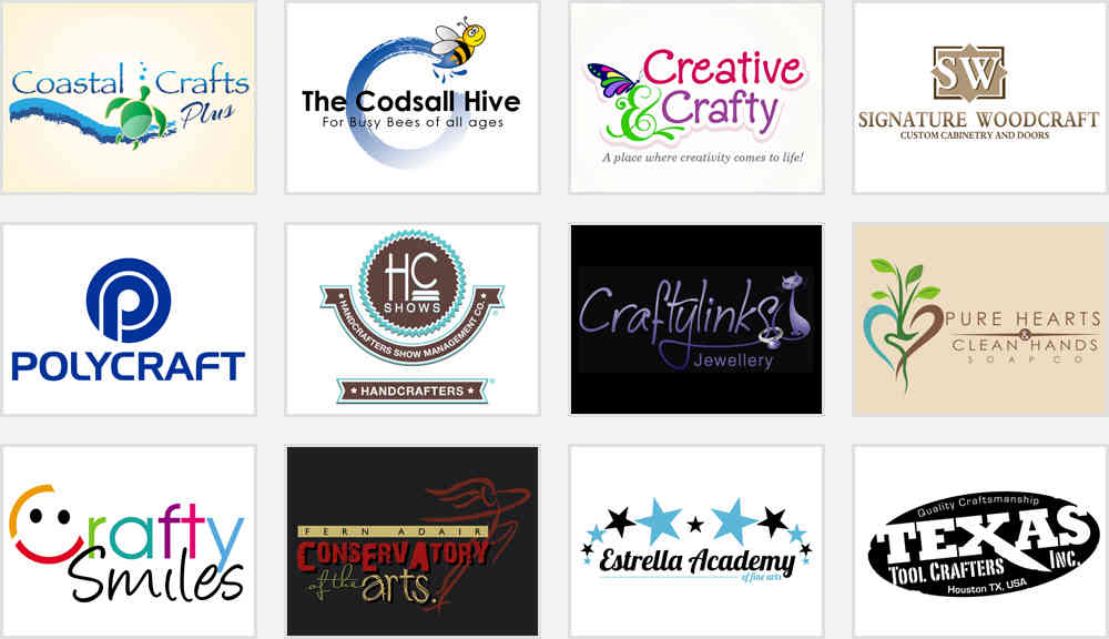
A handicraft logo should reflect your product line and design aesthetics, from the font choice to the color scheme. Let's say your business is known for making pastel colored clothing materials, in this case it makes little sense to have a design that only makes use of primary colors and block letters. Instead, soft colors coupled with a delicate font, make more sense. Generally, in this trade, serif, sans serif and cursive typefaces work really well and it makes the name of your business stand out, without looking too bold or serious. Depending on the kind of handmade goods you're selling, you can experiment to a certain degree.
Always keep your target audience in mind and be sure to incorporate a font that's clearly visible and understandable. The font you select should be tried and tested on print materials as well as online stores, including the company website.
Going for an artistic font is best avoided as you want your logo to stand out even from a distance. Moreover, it should be visible to the average person, when it is scaled up or down according to where it is displayed.
The design you choose should be just as distinct on a business card design as it is on a branding material, or even your shop's front door.
Choosing appropriate color schemes can be a time-consuming and thought provoking process. What kind of message do you wish to project? How do you want people to feel about your business? If your shop specializes in selling kid's handmade goods, you wouldn't want to have a bold font with dull colors. Bright colors with an artsy font would be the best thing for such a youthful business.
Different colors evoke different emotions in people. Primary colors like red are associated with strength, blue with calmness, and green with peace and harmony. Similarly, other hues like brown convey seriousness. Yellow signifies youth and exuberance, and orange communicates zeal as well as reliability.
White is associated with purity, while black shows sophistication. Speaking of colors, a good handicraft image identity always looks good on all mediums, which includes grayscale/black and white like newspaper ads, for example. Test it out at length to make sure there are no design pitfalls. In short, the design needs to look good in color, and just as good without it.
Remember, if you're marketing to audiences overseas, the language of colors can have different a meaning. Special consideration should be given in cases where your business reaches out to online customers from different parts of the world.
Hire a professional logo artist to work out all these intricate details of your logo design, as you don't want to compromise on a single attribute. A memorable design has a polished look which can keep your business on the map for years to come. It goes without saying that hiring professional expertise is a healthy long-term investment.
It would be smart to look at the handicraft business identities of your competition to make sure your design doesn't clash with theirs, even though they may be selling similar products. See the kind of target audience they cater to and how they win them over. Think about how you could do all that or even better.
Run some branding comparisons and narrow down the reasons of why you think your target audience would choose your business over your competitors. It's time to reflect on your brand and capitalize on all these elements to make your identity shine through and through.
