SALES / SUPPORT : +1-877-525-5646 |
Login
AG Gallery
|
Contest Holder
ginablu
?
Last Logged in : 2834days9hrs ago |
Concepts Submitted
147 |
Guaranteed Prize
300
|
Winner(s) | A Logo, Monogram, or Icon |
|
Live Project
Deciding
Project Finalized

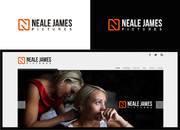
AG Gallery Logo
AG Gallery
Yes
Contemporary photography for children and family. Current logo can be viewed at http://aggallery.net
Photography
Logo Type
![]()
Initials
![]()
Unique/Creative
Clean/Simple
Sophisticated
Modern
grey, silver, beige, teal, green, blue, ivory
not sure
Not big on script fonts or cutesy logos. Also nothing too industrial or tech looking.


Comments
Project Holder
Project Holder
Project Holder
Project Holder
Project Holder
Project Holder
Project Holder