SALES / SUPPORT : +1-877-525-5646   |  


Biz Cards, email signature and stationery

design for high tech consultant in 3D architecture

Contest Holder mybimhero ?

Last Logged in : 3298days1hr ago

Concepts Submitted

90

Guaranteed Prize
99
Winner(s)

1

Business Cards and Stationery veildAll design entries can be viewed by other designers.
tick_gray

Live Project

tick_gray

Deciding

tick_blue

Project Finalized


Project: Biz Cards, email signature and st ...
Industry: Consulting Logo
Contest Launched: Nov 12, 2011
Selected: 1 winning design from 90 concepts
Winning Design by: Achiver
Close Date: Nov 19, 2011


Biz Cards, email signature and stationery - Consulting


Awarded as a winner
Project Report    

Sort by:


#87

#86

#84


Creative Brief


Biz Cards, email signature and stationery

design for high tech consultant in 3D architecture

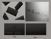
I need double sided standard sized Business Card [3.5" x 2"]

Use same font as used in my logo

Cutting-Edge

Modern

Professional

Simple

Thomas Whisker

BIM Consultant - Revit Specialist

3948 26th St, Suite 3 San Francisco, CA 94131

902-0953

tmw@mybimhero.com

www.mybimhero.com

AIA, LEEP AP

You may also consider a second font for the text. Something high tech sans serif. But there can only be TWO fonts and one must be from the logo. The license # goes after my name. the two titles can be stacked or side by side. My name should be most prominant.

I would like the back to contain the full logo with icons for EBLOGGER, TWITTER, FACEBOOK, GOOGLE +1, YOU TUBE, LINKEDIN and the web address

Consulting

Related Contests


Discussion


Comments

  • November 19, 2011 2:43 AM
    mybimhero mybimhero
      Project Holder
    I couldn't sleep and I need to get this to the printer. This was a very close one and you all had elements that I really liked. I wish I had a 5th that was parts from each of you. But I had to go with #87! It was the swoosh that picked up on the hero part of the name that did it for me. Congratulations ACHIVER!! Thank you for participating everyone and best of luck to you.

    Like Icon 0   DislikeIcon 0
  • November 19, 2011 1:02 AM
    mybimhero mybimhero
      Project Holder
    Thanks for all the great work everyone. Please double check your artwork to the sample I uploaded so that it bleeds past the crop marks. please also make sure you have the correct phone, email, blog, wen, etc... I will be making a decision tomorrow morning and hopefully you can get artwork to mycroburst. Thanks again.

    Like Icon 0   DislikeIcon 0
  • November 18, 2011 9:10 AM
    mybimhero mybimhero
      Project Holder
    Thanks everyone. GENBULLZZZ - #83 looks good. Thanks. ACHIVER - #79 looks good. please make sure phone is 415-902-0953. Leave the icons in purple and make my name blue. Thanks everyone. I will be back tonight.

    Like Icon 0   DislikeIcon 0
  • November 18, 2011 1:09 AM
    mybimhero mybimhero
      Project Holder
    I just uploaded Business Card layout template a PDF of the dimensions that the artwork must be - it needs to go past the 2 x 3.5 to 2.25 x 3.75. Please confirm yor artwork meets this layout. Thanks

    Like Icon 0   DislikeIcon 0
  • November 18, 2011 1:02 AM
    mybimhero mybimhero
      Project Holder
    Like the hard work everyone is doing - it looks great. keep in mind a few things. I like the icons for contact info - they should be the same in appearance, style color. Cell, email, and blog shold be together. BLOG = mybimhero.blogspot.com Make sure reflections of cube look like #1. i also like thin vertical lines that seperates information. You can try some different variations in colors if you like - purple or blue for my name - etc. CARNN - #75. Please show just 3 little cubs on ghost image in the banner. Please remove the large ghost cube on the back of the card. I like the social media reflections but it doesnt work on letter. you can loose the ghost cube there. XPERT - #78. I liked the globe you had for the website - please use it and make the blog purple like others. Look at the reflection of cube - doesnt look like #1. Add phone number to letter. GENBULLZZZ - #76. Please make cell email and blog similiar. Add blogspot to letter and email as well as phone to letter. ACHIVER - #79. Change order to cell, email, blogspot with everything.try seperating out web address and centering - letters spread apart. use mybimhero.blogspot.com. We can also try front of cards with no web address (its on back). Thanks and see you in the morning. Good night.

    Like Icon 0   DislikeIcon 0
  • November 17, 2011 9:42 AM
    mybimhero mybimhero
      Project Holder
    Looking good everyone. Dont be afraid of white space! I like the rounded corners of the cards - please make sure that the artwork for the cards bleeds out 1/8" so the artwork is 2 1/4" x 3 3/4" and then cropped in 1/8". This will help printer and he can make square or rounded corners. CARNN #70 - In the banner show just the little cubes ghosted. There seems to be too much of the logo. just a hint of it in ALL banners. Please make the logo on back of cards 90% of what it is. I like the icons and the the light blue back of cards. GENBULLZZZZ - #74 - The logo looks cut off everywhere. Please show all of the reflection like #1. Make contact icons more uniform. ARCHIVER - #73. Please add an icon for blogger and remove ghosted logo from bottom of vertical card. the contact icons and font still look squashed. Thanks - more tonight

    Like Icon 0   DislikeIcon 0
  • November 16, 2011 10:53 PM
    mybimhero mybimhero
      Project Holder
    looking great everyone - thanks for the hard work. Please make sure blog address mybimhero.blogspot.com is on card, letter, and email signature. I prefer the icons for contact info. This is a high tech - keep that in mind. CARNN - I like #66. Please make only just the little cubes ghosted in the top banner. Can I see the web address with the letters spaced more apart. Add social media to the letter also. Try the log on the back of the card to be about 75% of what it is now. I prefer the icons for cell,mail,etc. add blogger to card and letter. Can I also see an email signature and horizontal cards. GENBULLZZZZ - i like #67. Please add little more reflection of HERO to the front of the card. Please use symbols for contact information and add blogger and social media to letter. XPERT - I like #68. Please add blogger address to cards email signature, and letter. reflection of the bottom of the cube looks fuzzy - maybe cause it's transparent? Looks off. ARCHIVER - I like #69. The icons and text seem to be squashed. Please look at it or a taller font - maybe arial narrow. My blog address needs to be added to cards, letter, and email signature. Let's see the cards without the ghost. Like the way icons sit on the bar in #59 - try that on back of cards only. Prefer the address in the top envelope - use it in both. Thank you. keep up the great work. This will be another tough decision. Good night - back in the morning.

    Like Icon 0   DislikeIcon 0
  • November 16, 2011 9:52 AM
    mybimhero mybimhero
      Project Holder
    Looks good everyone. please add blogger address mybimhero.blogger.com to where you have phone and email. GENBULLZZZZ- I like #65. the letter head needs something on top though - maybe a bar. Please also add social media to bar. XPERT I like #64 - Prefer one color purple use for box on horizontal card. Add purple box to email signature - please make sure they are all the same purple. Looks different form vertical card. ACHIVER - I like #63. I prefert he envelope with the swoosh. please just have address on envelope. No social media or phone/email. Thanks everyone - I will be back tonight at 8 PM PST

    Like Icon 0   DislikeIcon 0
  • November 15, 2011 12:35 AM
    mybimhero mybimhero
      Project Holder
    Hey everyone - it is really starting to take shape and things look good! Please make sure that social media buttons are on back of the cards and email signature in order - Blogger, Twitter, Facebook, Google+, Youtube & Linked IN. Please also add my blogger address - mybimhero.blogspot.com to the card with cell and email. GENBULLZZZZ - I like #57. Please tighten smaller icons) up the back layout so there is more space to write. Please use the order from above from top to bottom. Let's look at the logo on back 75% of icon width. I think the logo should be 75-100 of the icons - not bigger. Add social media to email signature and ghost the lower right cube. On the letter move the address to the right of the logo. XPERT - I like #56. I really like the icons for cell and email. Please move the logo to be on top of social media as in the horizontal version. On horizontal card fron move the name and address to the left and add purple block to the name. Prefer letter and email signature on the left. Add social media icons to email signature. CARNN - I like #55. The AIA. LEED AP gets lost on the front of the card. need to make them readable - maybe lighten the grading across the entire design &/or bold letters and my nake larger. Please add the band to the bottom of the back of the card for the web address. The email address on the letter is the same for eveything tmw@mybimhero.com CREATOR - Please add social media and the web address to the back of the card. You can get rid of the black - there needs to be space for writing notes on back. Add AIA, LEED AP to the end of my name (like MD for a doctor). ARCHIVER - I like the curves in #49. Please take the ghost off the front of the cards. I like the cell and email icons. Remove the wave from the bottom of the vertical card. Let's use the email signature on the right - keep the waves same on all - make the logo little smaller so it can fit up in upper right corner. Thanks again - keep up the great work. I'm off to bed and will check things out in morning with brief comments.

    Like Icon 0   DislikeIcon 0
  • November 14, 2011 9:28 AM
    mybimhero mybimhero
      Project Holder
    Looking good everyone. GENBULLZZZZ - I like #53. Please lighten the cube in lower corner to be ghost like in #52. Lighten the back of the biz card more. Add an email signature. ARCHIVER - I like #49. Please add social media to email signature. Please also add envelope. CREATOR - Please add social media to back of #48. No dark colors - people need to write notes on there. CARNN - Like #42 - please add blue band with purple at top of front to back bottom where web address is. XPERT - Like #51 - Prefer the light envelope back - 3 colors only. add social media to email signature. Thanks everyone - back home 8 PM (california) tonight

    Like Icon 0   DislikeIcon 0
  • November 13, 2011 8:29 PM
    mybimhero mybimhero
      Project Holder
    GENBULLZZZZ - I like #33 and #34. Please make the colored back a light blue so that people can write notes. Please also make the logo 75% the width of the social media and put it closer on top of the buttons so thee is space on top to write notes. Let's see some stationary and email signature. ARCHIVER - I like #35. Please put AIA, LEED AP after my name. Let's see some stationary and email signature. XPERT - I like #37 & #39. Let's remove the vertical bars from #37. The logo on the back should be smaller than one on the front. Let's see some stationary and email signature. Thanks everyone. I will be at work this week, so will be able to make short comments in the morning at 7 AM and longer comments at 8 PM (California time).

    Like Icon 0   DislikeIcon 0
  • November 13, 2011 1:42 PM
    mybimhero mybimhero
      Project Holder
    Looking good everyone. Keep in mind you can use a second font of your choice. There needs to be a fair amount of space on back to write notes. My name should not be over any image except for white/color space. My NAME IS MOST IMPORTANT part of the card. Think how this will work into letterhead, email signature as well. XPERT - Please add the web address on the back to them all. #22 & #23 - let's see them without the background logo. I like the solid color tab for the name in #23. #24 & #25 I like all the contact information together. What would be little white symbol for blog? Maybe use the band to highlight something else. #26 Do not like the dark or the little cubes. the logo can stand alone by itself. It may work with stationary but card is too small for logo multiple times. I dont like #27. my name is most important. I also do not like block in #32. I like the layout in #31 - let's see it with no bg logo and web address on back. GENBULLZZZZ - I like #30 with the cube in corner. Use the logo with name on the back. Create more white space on back. Please swap Google+ with Linked In. Please revise the back of #29 the same way - also use the same color band for the web address on the back. Thanks - I would like to start seeing how some of these look in stationary and email signature.

    Like Icon 0   DislikeIcon 0
  • November 13, 2011 11:22 AM
    mybimhero mybimhero
      Project Holder
    XPERT - #21 looks good. I like the icons - There only needs to be one phone number. Please remove the telephone line and add 415 area code to cell. Social media is only 6 and in this order: Blogger, Twitter, Facebook, Google +, You Tube, Linked IN. Please add AIA, LEED AP to the end of my name (its the same as doctor-MD but for an architect. Can i also see something in a vertical. Thanks.

    Like Icon 0   DislikeIcon 0
  • November 13, 2011 9:56 AM
    mybimhero mybimhero
      Project Holder
    Looking good everyone. Please keep in mind this will include stationary (1st & 2nd page letterhead, envelope) and email signature as well. My web LAYOUT is www.mybimhero.weebly.com - design will be the next contest. Feel free to experiment with something different if you wish. CARNN - I like #15. Please make the social media logos smaller so they go across in one line. Also make the logo smaller so it includes My BIM Hero. This way they know to look for that name under all social media. I would like for all of it to be close to bottom so there is white space on top to write notes. Please do the same on the back of #13 ACHIVER - The dark blue is too dark. I would prefer 3 colors - Dark Blue from HERO, Purple from BIM, and a lighter blue (see top of left side of cube). I want people to be able to write notes on the back so it should have minimum graphics. I like the layout of #19 the best and let's see how it looks vertical. Genbullzzz - #17 looks good - let's see what the back looks like. Please also include AIA, LEED AP after ,my name - it is my licensing. Also phone # should be 415-902-0953. I like the text not being on top of graphic. Looking great guys - thanks. Looking forward to the next round!!

    Like Icon 0   DislikeIcon 0
  • November 12, 2011 6:05 PM
    mybimhero mybimhero
      Project Holder
    CARNN - I like the vertical. How about #9 with the top of #4 and #5 with the bottom of #3?

    Like Icon 0   DislikeIcon 0
  • November 12, 2011 5:57 PM
    mybimhero mybimhero
      Project Holder
    CARNN - WOW off to a great start. I would like to use some color so #1 #6 #7 are out. I prefer the contact info to be on white background - my name doesnt stand out in #2. I dont like how #4 breaks it up. I like the blue box with the thin purple band as header though. I will incorporate this into web design next - I envision that site having a rounded corner box with the top similir to #4 holding the title. I also like the top of #5 that the name is to the side of the logo. i like the web address seperate in the bar like #3 and #8. Please make the cell number 415.902.0953 and add AIA, LEED AP after my name but at 75% of the name. We can also drop the words cell and email. Thanks.

    Like Icon 0   DislikeIcon 0
  • November 12, 2011 4:46 PM
    mybimhero mybimhero
      Project Holder
    This project is for business cards, stationary (1st page & subsequent & envelope), email signature. I need to see the first page in color and b/w. The biz cards may be vertical or horizontal. The logo on the back should have the reflection. If you use one on front - it may be with or without reflection. I would like the email signature to contain the social media logos as in the back of the cards - I will connect them with html link. If you have ANY questions - please ask. I believe in LOTS of communication and feedback - please go see my finalized logo contest. Good luck and I look forward to some great stuff.

    Like Icon 0   DislikeIcon 0