SALES / SUPPORT : +1-877-525-5646 |
Login
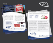
Brochure and email signature
|
Contest Holder
jdyoung
?
Last Logged in : 4655days9hrs ago |
Concepts Submitted
71 |
Guaranteed Prize
300
|
Winner(s) | Marketing collateral |
|
Live Project
Deciding
Project Finalized

Blackstone Auction Group
Brochure and email signature
Real Estate
Upscale, established and trustworthy


Comments
Project Holder
Project Holder
Project Holder
Project Holder
Project Holder
Project Holder
Project Holder
Project Holder
Project Holder
Project Holder
Project Holder
Project Holder
Project Holder
Project Holder
Project Holder