SALES / SUPPORT : +1-877-525-5646 |
Login
Dalton Wilt
|
Contest Holder
DaltonWilt
?
Last Logged in : 4785days3hrs ago |
Concepts Submitted
212 |
Guaranteed Prize
300
|
Winner(s) | A Logo, Monogram, or Icon |
|
Live Project
Deciding
Project Finalized

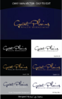
Dalton Wilt - Investment Firm logo and Website design
Dalton Wilt
Investments
No
We're a 22 year old regional (Midwest) investment firm. We deal with retail clients, but we're entering in to a growth phase where we're recruiting new brokers. Our old site is dated and has the old firm name. Contact me privately if you're interested in submitting and I'll send you to see the old pages. Obviously, traditional investment firm 'look and feel' is somewhat conservative by nature, but we don't want to appear boring and mothballed. We're a dynamic company and we want a logo and overall web design that looks 'large company' and professional. This is wide open, but we'll give daily (candid) feedback on submissions to direct the development. Our current colors are blue/red-orange, but we've been playing with red/black. Don't feel constrained. We're stoked to see what you come up with.
Financial Services
Logo Type
![]()
Symbolic
![]()
Abstract Mark
![]()
Initials
![]()
Illustrative
![]()
Cutting-Edge
Sophisticated
Corporate
Modern
High Tech
Serious
Masculine
We're open here. As I said, our old site was 2 color; medium blue with red-orange. We've looked at red/black, but we really don't want to constrain the process.
3


Comments
Project Holder
Project Holder
Project Holder
Project Holder
Project Holder
Project Holder
Project Holder
Project Holder
Project Holder
Project Holder
Project Holder
Project Holder
Project Holder
Project Holder
Project Holder
Project Holder
Project Holder
Project Holder
Project Holder
Project Holder
Project Holder