SALES / SUPPORT : +1-877-525-5646 |
Login
NICOM
|
Contest Holder
bbrace
?
Last Logged in : 2010days20hrs ago |
Concepts Submitted
751 |
Guaranteed Prize
300
|
Winner(s) | A Logo, Monogram, or Icon |
|
Live Project
Deciding
Project Finalized
Logo for corporate and construction services
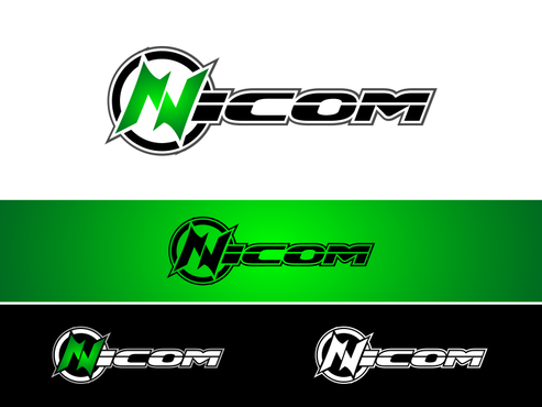
NICOM
No
professional, strong and bold
Corporate Services
Logo Type
![]()
Abstract Mark
![]()
Masculine
Modern
Cutting-edge
Professional
High Tech
black, bright green and white also would like to see blue,green and black
3
we are an electrical and telecom services company that also provides corporate services in the construction industry


Comments
Project Holder
Project Holder
Project Holder
Project Holder
Project Holder
Project Holder
Project Holder
Project Holder
Project Holder
Project Holder
Project Holder
Project Holder
Project Holder
Project Holder
Project Holder
Project Holder
Project Holder
Project Holder
Project Holder
Project Holder