SALES / SUPPORT : +1-877-525-5646 |
Login
Six Seasons Sports
|
Contest Holder
sixseasonssports
?
Last Logged in : 3451days11hrs ago |
Concepts Submitted
206 |
Guaranteed Prize
250
|
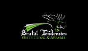
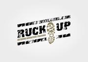
Winner(s) | A Logo, Monogram, or Icon |
|
Live Project
Deciding
Project Finalized

Logo for outdoor sporting good company
Six Seasons Sports
No
We want the logo to representing our company, Six Seasons Sports, and convey a passion for outdoor sports, love for nature, and the outdoors. Want both the words "Six Seasons Sports" and a symbol to be incorporated into the logo. Examples of both are uploaded as an attachment to this project. Combine both ideas into a single logo. Must be clearly recognizable by either the symbol only or the spelled out words. Don't have to be bound by the samples we uploaded, feel free to be creative, but our personal best idea is attached. Want people to be able to recognize us by either the full name of the symbol.
Outdoors
Symbolic
![]()
Abstract Mark
![]()
Initials
![]()
Masculine
Simple
Professional
Rustic
Plants-Sky-Earth colors. For example, Green-Blue-Gray Green-Blue-Brown Green-Blue-Slate Our website has all of the colors above.
3
Please see the attachment for more detail.


Comments
Project Holder
Project Holder
Project Holder
Project Holder
Project Holder
Project Holder
Project Holder
Project Holder
Project Holder
Project Holder
Project Holder