SALES / SUPPORT : +1-877-525-5646   |  


modern logo real estate company

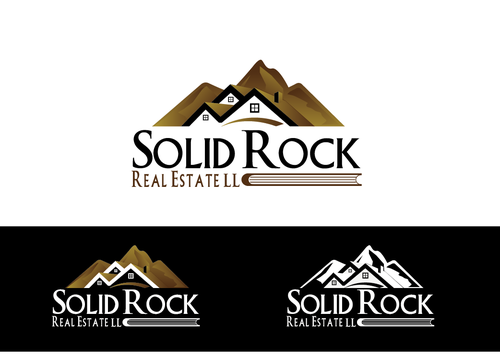
SOLID ROCK Real Estate llc

Contest Holder efreeman ?

Last Logged in : 3822days46mins ago

Concepts Submitted

117

Guaranteed Prize
200
Winner(s)

1

A Logo, Monogram, or Icon veildAll design entries are veiled from other designers till the end of the contest.
tick_gray

Live Project

tick_gray

Deciding

tick_blue

Project Finalized


Project: modern logo real estate company
Industry: Real Estate Logo
Contest Launched: Oct 24, 2013
Selected: 1 winning design from 117 concepts
Winning Design by: LogoXpert
Close Date: Oct 30, 2013


modern logo real estate company - Real Estate


Awarded as a winner
Project Report    

Sort by:


#10


Creative Brief


modern logo real estate company

SOLID ROCK Real Estate llc

No

Firm foundation trustworthy

Real Estate

Symbolic
Symbolic

Abstract Mark
Abstract Mark

Character
Character


Modern
Simple
Professional
Casual

Would like to keep it to two or three colors with

3

thinking some type of character of a rock formation With the words underneath or to the right.

SOLID ROCK
Real Estate llc (this being much smaller and centered under SOLID ROCK)

Related Contests


Logo for a Luxury Homes Real Estate Professional
$200
Prize Money
69
Concepts
Classy and sophisticated logo for residential real estate company.
$501
Prize Money
672
Concepts
Logo for a Real Estate Team
$225
Prize Money
108
Concepts
Logo for real estate company
$200
Prize Money
251
Concepts

Discussion


Comments

  • October 26, 2013 1:38 PM
    efreeman efreeman
      Project Holder
    I really like the style of the rock formation (not pointed and jagged) in #58 & 59 and the using of shades

    Like Icon 0   DislikeIcon 0
  • October 25, 2013 9:23 AM
    efreeman efreeman
      Project Holder
    The integration of a house and a mountain (rock) in #9 is clever and the spacial relationship is good, I prefer the style of rock/mountain in #8 or #12, tks

    Like Icon 0   DislikeIcon 0
  • October 25, 2013 9:15 AM
    efreeman efreeman
      Project Holder
    I like the three gables above the words I think I would definetley like the more substantial roofline that this presents, I think that looks better I like the spacial relationship of 17 and 24, I like a the little window in each gable. #10 was very clever in the use of the i If there were a way to do that and have three gable that might look nice. thank you

    Like Icon 0   DislikeIcon 0
  • October 25, 2013 1:23 AM
    valiWORK valiWORK
     
    Dear PH, Feedback is welcome.

    Like Icon 0   DislikeIcon 0
  • October 24, 2013 5:43 PM
    efreeman efreeman
      Project Holder
    Thank you. I like the size relationship of the icon and lettering in # 1 and 2, I like the concept of a bolder stronger font for solid rock, not sure any of these are what I am looking for. I do like the font for "real estate llc" as seen in #4 I would like an icon or graphic above the words, I had originally thought a rock like El Capitan at Yosemite but I thinks a very simple depiction of a house would work as well or maybe better as in the house is sitting on the Solid Rock. Thank you.

    Like Icon 0   DislikeIcon 0
  • October 24, 2013 4:59 PM
    kingmaster kingmaster
     
    WELCOME TO FEEDBACK

    Like Icon 0   DislikeIcon 0