SALES / SUPPORT : +1-877-525-5646 |
Login
FK7 Photography
|
Contest Holder
fk7photography
?
Last Logged in : 4144days2hrs ago |
Concepts Submitted
358 |
Guaranteed Prize
250
|
Winner(s) | A Logo, Monogram, or Icon |
|
Live Project
Deciding
Project Finalized

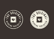
Photographer's Logo - Babies, Weddings, Portrait
FK7 Photography
No
My studio has been in business for over five years and a rebranding is now in order. I am a young, energetic photographer in my mid-twenties. The logo should reflect that energy and modern look. I love contrast. My work is often punchy.
I'd like the logo to convey a message of modernity, style and elegance.
Photography
Abstract Mark
![]()
Initials
![]()
Masculine
Modern
Cutting-edge
Sophisticated
Professional
The logo will help shape the rebranding of the studio Color combos I like, though I am open to new styles. No more than 3 colors per design (except gradients). Not looking for multicolor/rainbow styled logos. Colors I like: red/gray/black orange/white/charcoal My current logo used blue/white/gray but I grew tired of it after five years, and I find it too traditional. Current logo: http://www.fcphotog.com/fclogos.jpg
3
I prefer boxy designs over wavy and circular, though a boxy font with a wavy emblem can look nice (contrast between the two).
Though the business used to be called "Francis Cossette Photography", I've renamed the studio "FK7 Photography". "F" stands for Francis, "K7" pronounced in French sounds almost identical to my last name's pronunciation. Therefore, "FK7" are my initials, with an original twist.
I would like the "FK7" part of the logo (could be an emblem, embossed text, textured text, etc.) to be able to stand alone as a watermark on pictures without the "photography" part attached to it all the time. The FK7 should be modern looking, stylish, but CLEAN. I do not like busy looking logos.
I like symmetry.
Logos must stand out on white/pale/light gray background, but must also remain visible on busy/darker backgrounds.
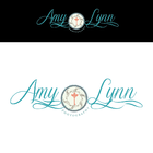
I've imagined "FK7" in a fat/bolder font type. No script-like font (my current logo uses it).
Here is what I DO NOT want:
Any aperture-like symbols
Here are logos I came across I liked:
http://www.mycroburst.com/drafts/display/contest/351062/draft/2294189
http://www.mycroburst.com/drafts/display/contest/347383/draft/2301784
http://farm9.staticflickr.com/8010/7462069814_e8d51eff9a_b.jpg


Comments
Project Holder
Project Holder
Project Holder
Project Holder
Project Holder
Project Holder
Project Holder
Project Holder
Project Holder
Project Holder
Project Holder
Project Holder