SALES / SUPPORT : +1-877-525-5646 |
Login
Business Cards (for designer "thanhsugar"
|
Contest Holder
Janabiyah
?
Last Logged in : 2866days9hrs ago |
Concepts Submitted
28 |
Guaranteed Prize
100
|
Winner(s) | Business Cards and Stationery |
|
Live Project
Deciding
Project Finalized

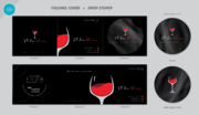
RESTRICTED CONTEST: Winetaster NY Business Cards
Business Cards (for designer "thanhsugar"
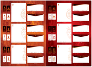
I need double sided standard sized Business Card [3.5" x 2"]
Use same font as used in my logo
As before
Cutting-Edge
Modern
Jeff Geesing
Managing Director
Not printed on card
646 643 9760
jeff@winetasterny.com
www.winetasterny.com
I need you to use the same design just change the Gosling Wine to Winetaster NY (the NY should be a little smaller exactly like the web page I am sending you) I like the use of the symbols for phone, web etc Can you align left and see how it looks
Beverages


Comments
Project Holder
Project Holder
Project Holder
Project Holder
Project Holder
Project Holder
Project Holder
Project Holder