SALES / SUPPORT : +1-877-525-5646 |
Login
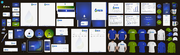
Looking for some cool stationery designs
|
Contest Holder
smilroy69
?
Last Logged in : 2644days16hrs ago |
Concepts Submitted
76 |
Prize Money
75
|
Winner(s) | Business Cards and Stationery |
|
Live Project
Deciding
Project Finalized

Stationery for an Oceanic Environmental Research Foundation
Looking for some cool stationery designs
I need single sided standard sized Business Card [3.5" x 2"]
Use same font as used in my logo
unzialish
Cutting-Edge
Professional
Scott P. Milroy, Ph.D.
President and Chief Scientist
AESIR Foundation 3586 Sangani Blvd., Suite L D'Iberville, MS 39540
228.332.6293
228.615.7820
228.332.6295
smilroy@aesirfoundation.org
www.aesirfoundation.org
The corporate image should NOT come across with a stereotypical “environmental” or “green-friendly” feel - those sorts of design elements are far too over-done. I’m likely to have a knee-jerk reaction to dislike anything with an obvious water/ocean color palette or design theme. Over-the-top aquas and greens are probably a “no”. And waves, ripples, or droplets are just too tired – aren’t there some more creative ways to get that point across? Stationery Ideas/Inspiration: Obviously, the logo should be featured prominently on both the business cards and letterhead. No specific requests for the letterhead, but try not to be so parochial in your design. Logo aligned left in the header is not exactly original; I’m not at all adverse to that, but it might be interesting to see some other ideas. For the business cards, I’d also like you to try to think outside the box. At the very least, it would be nice to have a section on the biz card, beneath the standard contact info, where I can enter some short text “headlines” to highlight what AESIR actually does (e.g. oceanographic research, environmental impact studies, environmental monitoring and consulting, marine science curriculum development, etc.) NUMBER OF COLORS: No preference. I lean towards the more simple 2-color designs. There is something to be said for keeping logo colors from getting too busy; a clever designer can use tonal shading of 2 colors to represent a great amount of detail and visual interest. However, if you find 2 colors limiting, by all means feel free to expand to 3 or 4 colors – I don’t wish to inhibit any great ideas. TYPE OF COLORS: As a general rule, I’m looking for very rich, warm colors. In addition to the cyan logo provided, it would be nice to see some other color ideas: “Fall” colors that are earthy without being stereotypical of a corporation with an environmental thrust. I’m thinking deep ambers, blood reds, olive to dark mossy greens, earthen browns. Don’t be afraid of black or deep shadows. FONT STYLE: Name of company ("AESIR") should be prominently featured in the font style provided (font "unzialish"). However, the other stationery/business card text can be in whatever typeface the designer chooses. However, that typeface style should be professional, clean, but still have an unusual/original feel (as long as it works with the unzialish style). In summary, I’m looking for a look so vintage, it’s more old world/ancient/medieval in feel. Because of the name AESIR, the design elements should evoke a viking flavor – runic typeset(s) and simple (almost tribal) scandanavian-style designs for graphics and/or icons. However, the design should most certainly be evocative of AESIR’s purpose.
N/A
Environment


Comments