SALES / SUPPORT : +1-877-525-5646 |
Login
Seryak Strength & Conditioning
|
Contest Holder
SeryakStrength
?
Last Logged in : 4701days13hrs ago |
Concepts Submitted
129 |
Guaranteed Prize
350
|
Winner(s) | A Logo, Monogram, or Icon |
|
Live Project
Deciding
Project Finalized

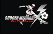
Strength and Conditioning
Seryak Strength & Conditioning
Yes
we provide strength and conditioning services to high school sport athletes. our program improves strength, speed, power, coordination and general work capacity. we do a lot of barbell work including powerlifting (squat, deadlift, presses) and olympic weightlifiting movements (clean and jerk and snatch), but also incorporate kettlebells and strongman implements such as tractor tires, sandbags, sleds, etc. we place a heavy emphasis on perfecting movement technique prior to adding intensity. we bring division 1 college level or higher coaching and programming quality to the high school level.
Sports
Logo Type
![]()
Symbolic
![]()
Unique/Creative
Clean/Simple
Serious
Masculine
black, white, "iron"/silver, we are open to a strong red or blue.
2
google image "strength and conditioning logo" for ideas. barbells are pretty common in strength and conditioning logos. these can either look original and cool or cheezy. we are not specifically asking for a barbell to be included, but if it is incorporated well there's a high probability it will be chosen. The same goes for images of persons performing weightlifting movements. A unique typography that potrays strength and athletecism in the right color combination could satisfy our needs as well.


Comments
Project Holder
Project Holder
Project Holder
Project Holder
Project Holder
Project Holder
Project Holder
Project Holder
Project Holder
Project Holder
Project Holder
Project Holder
Project Holder
Project Holder
Project Holder
Project Holder
Project Holder