SALES / SUPPORT : +1-877-525-5646 |
Login
EPO Gaming
|
Contest Holder
icegunner
?
Last Logged in : 3268days2hrs ago |
Concepts Submitted
56 |
Prize Money
250
|
Winner(s) | A Logo, Monogram, or Icon |
|
Live Project
Deciding
Project Finalized

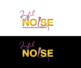
Stylized logo for an entertainment poker company.
EPO Gaming
No
We
are an entertainment poker company. Our logo should represent fun with poker. In particular, Texas Hold 'Em. We provide the same experience as a WSOP (World Series of Poker) or casino type of game, but without the expense and with a lot more fun and entertainment in a laid back atmosphere.
Entertainment
Logo Type
![]()
Symbolic
![]()
Abstract Mark
![]()
Unique/Creative
Clean/Simple
Modern
Fun
Playful/Cartoonish
Abstract
Would prefer standard card game type colors (i.e. black, red). But would also like casino table green as a possible color including texture (possibly as a background?). Basically, any color that could be found on a casino poker table
not sure
Some ideas that have been floated around include the following: card spreads, letters on card backs, stylized aces being turned up. The latter would be something like the attached image (though not turned up so high) but in an outline in the style of the Epic Mickey game's logo; like a paint splash. However, open to any options. Ultimately, it should be unique, simple and convey fun.


Comments
Project Holder
Project Holder
Project Holder
Project Holder
Project Holder
Project Holder
Project Holder
Project Holder
Project Holder
Project Holder
Project Holder
Project Holder
Project Holder
Project Holder
Project Holder
Project Holder
Project Holder
Project Holder
Project Holder
Project Holder
Project Holder
Project Holder
Project Holder
Project Holder
Project Holder