SALES / SUPPORT : +1-877-525-5646 |
Login
FM ONE
|
Contest Holder
ewforester
?
Last Logged in : 4576days17hrs ago |
Concepts Submitted
162 |
Guaranteed Prize
200
|
Winner(s) | A Logo, Monogram, or Icon |
|
Live Project
Deciding
Project Finalized

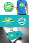
Trendy Clothing Store Sign
FM ONE
Trading Station
Yes
Clothing Store that sells popular brands only (ie: Hollister, AE, Abercrombie, ETC) gently used. Looking for something cool but clean. I think it looks cool in Pirulen font, but you guys are great so I will leave that up to you. GOOD LUCK!
Apparel
Logo Type
![]()
Clean/Simple
Sophisticated
Modern
Youthful
not sure
I think it would look good with FM ONE on top of Trading Station. FM ONE is the primary name, Trading Station is more of a description. But do whatever you like!


Comments
Project Holder
Project Holder
Project Holder
Project Holder