SALES / SUPPORT : +1-877-525-5646 |
Login
Vapolux
|
Contest Holder
ttambellini
?
Last Logged in : 4315days18mins ago |
Concepts Submitted
167 |
Guaranteed Prize
301
|
Winner(s) | A Logo, Monogram, or Icon |
|
Live Project
Deciding
Project Finalized

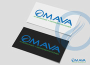
Vapolux Logo
Vapolux
Electronic Cigarettes
Yes
This is for a new electronic cigarette company. This will also be the brand name on the product.
General Merchandise
Logo Type
![]()
Initials
![]()
Clean/Simple
Sophisticated
Modern
High Tech
Undecided on the color. Would want something that looks good as grayscale or in color. Maybe some blue or green? Wide open for suggestions in this area.
not sure
I've messed with some online logo tools. I have three ideas here: http://vapolux.com/3601.html. I want a V similar to the one in logo 3, but not as wide. I like the font in logo 1. I like the flow of logo 2 where the angle of the V and the A are the same, and the curves in the rest of the name are similar to the curves in the tagline. I also want the logo to work with or without the tagline, and I want to be able to use the V alone as well.


Comments
Project Holder
Project Holder
Project Holder
Project Holder
Project Holder
Project Holder
Project Holder
Project Holder
Project Holder
Project Holder
Project Holder
Project Holder
Project Holder
Project Holder
Project Holder
Project Holder
Project Holder
Project Holder
Project Holder
Project Holder
Project Holder
Project Holder
Project Holder
Project Holder
Project Holder