SALES / SUPPORT : +1-877-525-5646 |
Login
Uk county accommodation and information
|
Contest Holder
whetstone
?
Last Logged in : 3535days14hrs ago |
Concepts Submitted
29 |
Prize Money
350
|
Winner(s) | Web Design |
|
Live Project
Deciding
Project Finalized

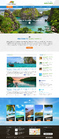
Web page design for travel site
Uk county accommodation and information
Travel
http://www.cornish-breaks.co.uk
This website lists many types of accommodation for people traveling or staying in the copunty of Cornwall, UK.
Dislike: 'Corporate' style look, fussy overcrowded pages. Too much colour. Like: Clear, uncluttered pages. Easy to use & navigate. Clarity.
Unique/Creative
Clean/Simple
Content Driven
Friendly
Family Oriented
Modern
Inspirational
Blue
Green
below header
http://www.abovebeachcottages.co.uk
http://www.egypt.travel
We want a page that will work with the current logo. We do not wish to change this aspect of the page. We also like the colours on the existing page.


Comments
Project Holder
Project Holder
Project Holder
Project Holder
Project Holder
Project Holder
Project Holder