The Ultimate Guide to Selecting Graphic Elements in Logo Design
Featured Image: Freepik.com/pikisuperstar
What do you think about when you look at an attractive logo design? The message it conveys or which elements have been used to connect with the viewer? Most people are likely to pay attention to both of those factors. Memorable and timeless logos are able to get people thinking for a long time. The graphic elements have a huge role to play in the success of a logo and brand strategy.
For instance, the colors or fonts can stay in memory and make it easier for consumers to recall the brand. Cadillac’s logo is recognized for its custom script that draws attention to the name. This is how graphic elements in logo design can impact the viewer and convert customers as well.
It’s why professionals in the industry and business owners pay a lot of attention to choosing the right ones in logo design. Whether you are designing a logo for your brand or working for a client, it’s important to understand what elements will stand out to the audience from the first look.
You can take the example of any famous and globally recognized logo. It could be the color palette, company name or imagery that people can remember or identify instantly. The golden arches of McDonald’s iconic ‘M’ are known for their distinct yellow and powerful impact.
This is just one example of how the graphic elements in a logo can increase awareness and recognition across the world. To help you create an impressive symbol, here is our ultimate guide to selecting graphic elements in logo design.
How to Pick Graphic Elements for Logos
Brand owners and professional graphic designers need to consider quite a few factors before getting started with the process. For instance, you should ask questions such as how do you want the audience to perceive your brand. What elements will represent the industry or niche of the business? Do I want to keep things simple or choose an elaborate design?
These are just some of the things that can influence your choice of graphic elements for a logo. Let’s take a look at a few useful tips and hacks that can help you select the best graphic elements in logo design.
Build A Customer Persona
Now, you can consider this as something similar to creating a brand persona. Just as you would define a brand and create a profile or personality with different traits for it, you need to build one up for your target customer. In branding, a customer persona is how you identify an ideal buyer for a range of products or services.
Most marketers and businesses create profiles for their potential customers and associate certain traits with them. This can help people understand the way a buyer may interact with a brand or behave when making a purchasing decision.
According to usability.gov, the purpose of a persona is to have ‘clear communication and reliable representation.’ Take the example of the B2C (Business to Consumer) buyer or customer persona created by Munro Shoes. It’s brief, highlights the relevant information and tells the brand what the customer expects from their products.
Customer personas can make it easier for you to select the right graphic elements in logo design. When you are brainstorming ideas in the early stages, think from the perspective of your target audience. Once you have an insight into their preferences and behavior, you can incorporate features that appeal to potential customers.
Here are some factors that can evoke a positive or negative response from the viewer.
Color Palette
Colors influence the perception of a brand and affect the mood of a potential customer as well. When you are aware of what your audience is looking for and their age demographic, you can choose soothing or energetic colors that convince people to invest in a product or service. If your customer base is mostly female, between the ages of 18 to 35, you may select colors like blue, purple or pastels that are sophisticated and showcase trust and reliability as well.
Relevant Fonts (Serif, Sans Serif, Handwritten and Script)
Once you are aware of your target customer, you can choose a font style that will appeal to them and communicate what a brand has to offer. Serif fonts can make a good impression on both young adults and people in the age bracket of 35 to 55 years. They are elegant and represent history or tradition. Consumers who do not want to spend a lot of time looking for trustworthy brands might be convinced to browse through a brand’s website or eCommerce store.
Abstract icons
Many people may be interested in the mystery or meaning behind an abstract icon. Construction businesses commonly use such symbols in their logos. With a customer persona, you can identify how to pitch your product or service in the best way possible. An attractive icon could get the attention of other business owners or online shoppers.
Balance and Alignment
When a logo is clear and communicates with the target audience, it becomes easier for them to understand the core message. Balance and alignment of elements are closely related to what your potential customer prefers. For example, if you are looking to reach out to experienced professionals who want to save time, then it’s a good idea to keep things simple in your logo. You can use a lot of white space or choose a wordmark or lettermark in modern Sans Serif fonts.
Logo Design Hacks
- Research the market extensively and run competitor analysis
- Understand what problems a product or service can solve for people
- Get feedback from surveys or a focus group
- Study color psychology and meanings of fonts
Image Source: underconsideration.com
Image Source: underconsideration.com
Image Source: ZillionDesigns.com
Find Industry-Specific Imagery
It’s important to clarify the niche or industry from the first look. Certain graphic elements can help you convey that to potential customers instantly. Animals, florals, shields or crests and nature imagery are a few design features that are specific to various industries.
Lions and panthers can convey strength, speed and reliability. Birds symbolize freedom and peace, and can have a calming effect on the viewer as well. There are many industry-specific logo design elements that you can use to create a memorable brand identity.
Automobile companies tend to use crests or animal imagery in their logos for a powerful impact on the viewer. The graphic elements are related to the automotive industry. If you take animals such as a horse or jaguar, you may think about speed, luxury and strength. When people are looking to buy a car or any vehicle, these are some of the qualities that they expect from the brand.
Similarly, other industry-specific imagery includes gears or wrenches that you may see in logos associated with construction, construction claims, or home improvement businesses. Many fashion or retail companies pick clothing items, shoes or accessories to tell people what they have to offer.
Logo Design Hacks
- Choose a symbol or image that brings the design together
- For a minimalist appearance, go with a geometric shape or lines
- Animals and florals can work well in elaborate logo designs or illustrations
Image Source: underconsideration.com
Image Source: underconsideration.com
Image Source: ZillionDesigns.com
Show Innovation and Creativity
It is a good way to create a brand symbol that is unique and stands out from the beginning. Just take the example of the logos of Beats or Cisco here. The brands have included a clever or hidden message in their designs that has generated a lot of interest among the audience. With graphic elements such as white or negative space, typography, and circular or dotted lines, you can easily add a unique factor to the logo design.
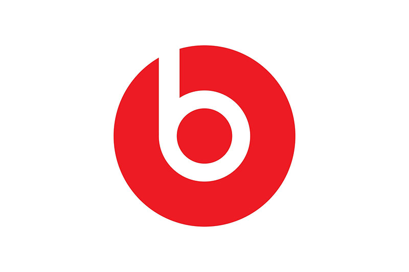
Image Source: 1000logos.net
Using white space creatively can help you hide an image or icon in your design that may represent the industry or positive traits associated with the brand. You can also incorporate diagonal lines, curves, loops or twirls to form a meaningful symbol or icon (think Airbnb’s logo).
Logo Design Hacks
- You can include hidden imagery that shows the specialty of a brand
- Merge an icon or shape with the typography if you can (FedEx has an arrow between ‘E and X’)
- Use color to create and deliver a clever message as NBC has done with their logo
Image Source: 1000logos.net
Image Source: underconsideration.com
ZillionDesigns.com
Test Elements on Digital Mediums
According to a report, out of all the different devices that are used across the world, around 79.6 percent of them are smartphones. This number is expected to rise in the future. As digitalization continues to take over everything we do, you need to focus on the various mediums where the logo design will be displayed.
While the website or eCommerce platform is one of the first places that the brand symbol appears, you should also focus on social media networks, videos, emails and blog posts.
When you are selecting graphic elements in logo design, you have to consider a range of different digital mediums. For instance, look at how the symbol or icon appears in a smaller size and resolution. Mostly, networks like Facebook, Instagram and Twitter resize the image that appears in display pictures on profiles or pages according to their requirements.
It’s a good idea to check the quality of the logo on such platforms. If the visuals are confusing and do not stand out on the social media page, then you may have to make some changes or adjustments to the elements.
For an illustrative design, you could consider a simple variation with a lettermark or wordmark. Minimalist logos require very less work and you can easily upload the file on Instagram or Facebook without compromising on the resolution or quality. You should also test how the logo appears as a watermark before finalizing the design. It will be displayed on videos that feature on the blog or Youtube channel.
Logo Design Hacks
- Test or preview the logo design on social media and the website
- Find the dimensions and sizes for each platform and adjust the elements accordingly
- See how the logo appears as a watermark or on posts on Instagram or Pinterest.
Image Source: underconsideration.com
underconsideration.com
Image Source: ZillionDesigns.com
Choose Colors That Last
If you look at popular logos like Nike or Coca-Cola, you will realize that the companies have made minimal upgrades to their color palettes. This is mainly because designers followed the guidelines given by the brands and chose a contrast or monochromatic tone that can remain relevant for years.
The Nike Swoosh for instance is known for its simple black and white colors. While the audience may have seen it appear in various shades of red at times, the company sticks to neutrals in branding materials on print and digital mediums.
Now, the trick to selecting the right colors for a logo is to research within the industry and take inspiration from the latest graphic design trends. You also have to keep in mind how the tones or hues will affect the viewers. Colors in a logo can help build an emotional connection with the target customer. To build loyal and recognition, you need to choose relevant ones that bring out happy memories or positive feelings.
A relevant color palette can also make it easier for people to align their values with a brand’s. So it’s important to pick two colors or just one that can last for decades or at least five to six years. These are a few color choices that are timeless and can stay relevant for a long time.
- Black: Represents Power and Strength
- Blue: Represents Security and Trust
- Red: Represents Energy, Happiness, and Passion
- White and Gold: Represents Luxury and Purity
- Earthy brown: Represents Nature and Stability
- Gray: Represents Sophistication and Balance
If you think about it, the colors can be paired with neutrals or in contrast with a lighter ones as well. You can also use red and yellow for a restaurant logo or a business in the food and beverage industry. Most fashion brands like to keep it simple and go with monochromatic colors or tones.
Logo Design Hacks
- Take a look at what your competitors have done with their logos before choosing colors
- Understand the CMYK and RGB color models for digital and print materials
- Select according to your industry and niche
Image Source: underconsideration.com
Image Source: underconsideration.com
Image Source: ZillionDesigns.com
Check Scalability in Multiple Formats
In logo design, scalability is one of the most key features that designers and brand owners have to keep in mind. The symbol or icon has to maintain its clarity on flyers, brochures, stationery, blogs and email templates.
If the elements appear confusing or overwhelming for the viewer, you may find it challenging to draw the attention of the audience. For scalability, professionals include deliverables for clients in various formats like PNG, JPG and SVG.
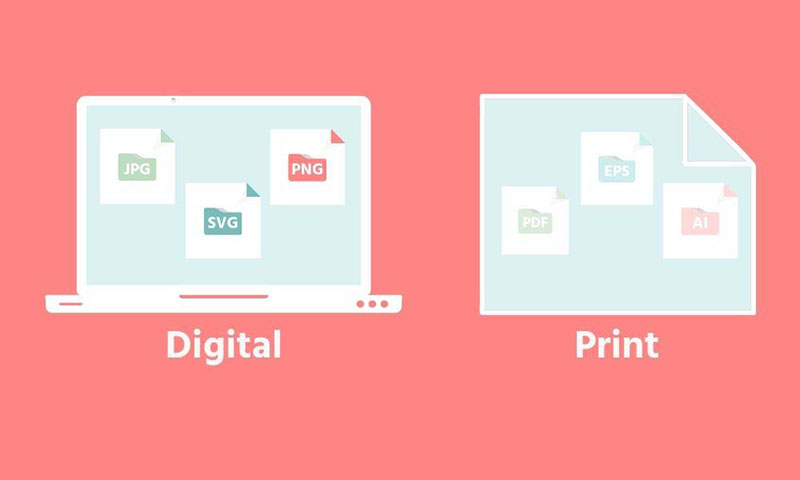
Image Source: meancreative.com
Once you know how your logo will look to the target customer in a smaller or bigger size, you can make changes accordingly. To check the scalability, you can create mockups as well.
Vector and raster-based graphics can be saved in SVG and PNG formats. You can see how the elements appear with a transparent background. JPG files work well for use on websites and in print as well.
Many online websites have developed free converters for the conversion of image files from one extension to another. One of these is theonlineconverter.com, an online web-based resource that has developed various converters for image file conversions. Whether you want to convert from PNG to JPG, Webp to BMP, or other formats, you can do that after landing on the platform. Every converter is free of cost, easy to use, and highly accurate.
Logo Design Hacks
- Test your logo in a lower and higher resolution
- Use PNG format for a favicon that will be featured on the website
- Check the logo against bright background colors
Image Source: commons.wikimedia
Check Usage and Functionality
For an effective branding strategy, you need to create print and digital campaigns that reach out to your target audience. This is where the usage and functionality of graphic elements in logos matter. Sometimes, abstract icons or symbols like an arrow, swoosh or speed lines can lose their meaning in clutter.
To avoid overwhelming the viewer, you need to include ample space around elements and create a balance with a neutral background or white space. This way, you can easily use the logo on a building, billboard design and branding materials like letterheads or brochures.
It’s a good idea for you to see whether a logo can work in 3D or animated effects. The elements need to boost functionality in different forms. This means that the image, icon and text should work well when they are static or dynamic.
Since a logo may have to appear on a wall or might have to be posted as a GIF on Instagram, you should check if the elements are recognizable.
Logo Design Hacks
- A lettermark with a shadow or glitch effect can be animated easily (Think PayPal’s logo)
- Abstract icons or symbols like an Apple or Globe could add to the functionality of a logo in 3D
- Choose one or two elements for a minimalist icon for increased usability and function
Image Source: dribbble.com/Hamza Ouaziz
Image Source: ZillionDesigns.com
Image Source: ZillionDesigns.com
Wrapping Up
This is our ultimate guide to selecting elements in logo design. If you are looking to create one for a client or a business, make sure that you keep these in mind. Follow some of the hacks given above to create a powerful logo that helps build recognition and awareness in a short time.

