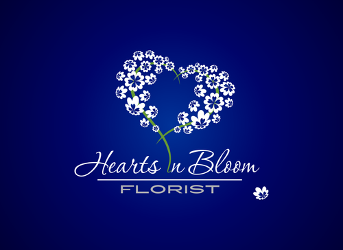
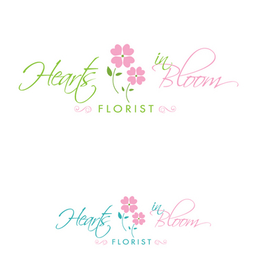
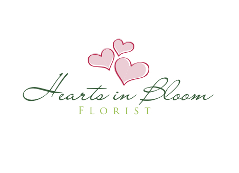
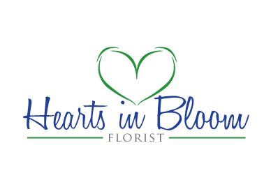
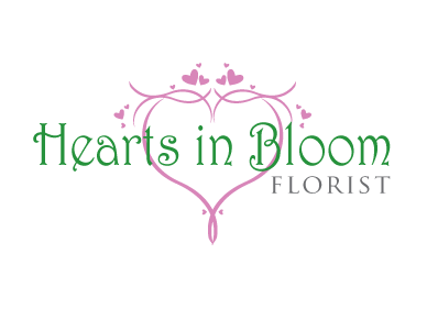
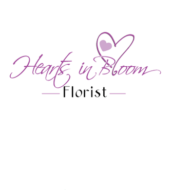
Floral business logo - Hearts In Bloom
Hearts In Bloom Florist
|
Contest Holder
frankj417
?
Last Logged in : 5496days9hrs ago |
Concepts Submitted
78 |
Guaranteed Prize
200 |
Winner(s) | A Logo, Monogram, or Icon |
|
Live Project
Deciding
Project Finalized


Creative Brief
Floral business logo - Hearts In Bloom
Hearts In Bloom Florist
Floral Boutique & Fine Gifts, A place where memories begin...
No
A new floral business logo. To be used on business signage, website, stationary, etc.
Miscellaneous
Abstract Mark
![]()
Cutting-Edge
Unique/Creative
Clean/Simple
Modern
Retro
Feminine
we are open to creative ideas, some of the colors that we like are greens (perhaps lime or a darker green), blues (royal blue, navy), fuschia, or shades of red/pink
not sure
Related Contests