SALES / SUPPORT : +1-877-525-5646   |  


Gourmet Shop & Bakery Logo

Greenock Gourmet & Bakery

Contest Holder dria13 ?

Last Logged in : 4805days15hrs ago

Concepts Submitted

44

Guaranteed Prize
250
Winner(s)

1

A Logo, Monogram, or Icon veildAll design entries can be viewed by other designers.
tick_gray

Live Project

tick_gray

Deciding

tick_blue

Project Finalized


Project: Gourmet Shop & Bakery Logo
Industry: Food Logo
Contest Launched: Feb 01, 2011
Selected: 1 winning design from 44 concepts
Winning Design by: BIMPOP
Close Date: Feb 08, 2011


Gourmet Shop & Bakery Logo - Food


Awarded as a winner
Project Report    

Sort by:


#22

#32

#21

#12

#26

#44

#43

#42

#41

#40

#39

#38

#34

#33

#31

#28


Creative Brief


Gourmet Shop & Bakery Logo

Greenock Gourmet & Bakery

sweet or savory for here or there

Yes

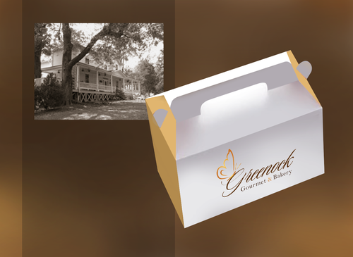
We are operating from an old (1830's) "gentleman's" farmhouse in a semi rural area. The site is Victorian in feel although the new shop & bakery more modern. It is still elegant with hardwood floors and nice furniture displays, not metal racks. Everything we make is from scratch using healthy and real ingredients. We use local when we can. We will have take out from the bakery/shop as well as an on site restaurant in the main farmhouse building. We also do custom wedding cakes.

Food

Logo Type
Logo Type

Symbolic
Symbolic

Illustrative
Illustrative


Unique/Creative
Sophisticated
Local/Neighborhood
Fun
Illustrative
Feminine

Nothing too bright. I would like it to show up well if printed on metallic stickers but also look good on plain paper stock.

not sure

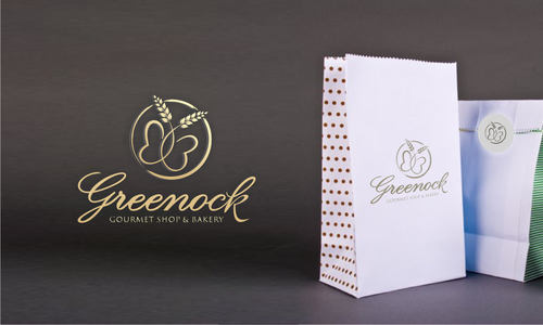
Although it has nothing to do with the business, I would love to see a butterfly incorporated if possible as a reference to my daughter.

Our B & B website shows the location and some of what we do. We are going to phase out the B & B as we open to the restaurant and bakery functions.
www.greenockhouse.com

I am completely open to your ideas and will comment back on your input.

The tagline can be included but is not mandatory. As a matter of fact, if you have a better tagline idea, feel free to try it out.

Related Contests


Logo for Restaurant
$250
Prize Money
188
Concepts
Logo for innovative cookie made of only two ingredients
$300
Prize Money
77
Concepts
Master Chefs
$390
Prize Money
222
Concepts
Logo for a bakery
$350
Prize Money
137
Concepts

Discussion


Comments

  • February 14, 2011 6:47 AM
    vector vector
     
    congrats, nice design........:)

    Like Icon 0   DislikeIcon 0
  • February 08, 2011 12:06 PM
    dria13 dria13
      Project Holder
    Thanks everybody. We are very happy with the options we have been given. We are doing a kind of informal survey of customers over the next few days just to see if our choices really work for them. We will announce the finalist within a few days.

    Like Icon 0   DislikeIcon 0
  • February 06, 2011 8:38 AM
    dria13 dria13
      Project Holder
    We are really loving the creativity coming through in all of these. I did some staring of the ideas to let everyone know our leanings right now. I'm going to be away for today, but will check in tomorrow to start narrowing down to our finalist. Thanks

    Like Icon 0   DislikeIcon 0
  • February 04, 2011 3:54 PM
    dria13 dria13
      Project Holder
    #1 I like the creativity of using the G's to form a butterfly but like your others choices better. #4 knock out by my partners. Although the K is interesting, they thought it is hard to read. Especially since our name is an unusual word anyway. #8 and #9 Definitely like the change to a brown word. We like the color of the butterfly on #9 better but the placement and form on #8. One partner doesn't like the & in the colored circle, she preferred the style of your #4. #10 I like the overlay of the words but the whole image feels too bold to us. #5 & #6 We like yours in the single tone better than two colors. We really like your butterfly style as it is abstract. One partner would like to see "Greenock" in a softer font, maybe even the same as "gourmet & bakery" but bold. I don't remember the font terms, but I think it is the feet on letters like n and k she doesn't like. #7 My favorite but both partners had issues. First, Lill does not want a dark background. She wants to be able to print on packaging (bags, labels, ribbon) of varying colors. The other partner really likes the font. It carries off the elegant feel we are after, but he is afraid the "G" is "too many curlicues" and therefore, hard to read. We all love the butterfly again. Thanks everybody for your hard work.

    Like Icon 0   DislikeIcon 0
  • February 03, 2011 4:12 PM
    dria13 dria13
      Project Holder
    Draft #4 I like the wing as part of the K but overall the feeling is a little too corporate. Draft #2 I like the flow but orange is very bright against the black words. Maybe brown tones for the words to soften the orange or try a different shade. Orange just doesn't make you think food or baked goods. Thanks for the entries. #2 is the favorite for now.

    Like Icon 0   DislikeIcon 0