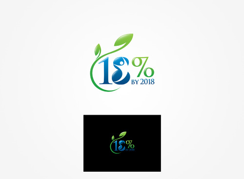
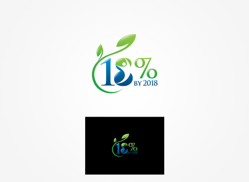
Logo for vision campaign.
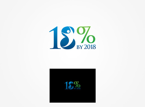
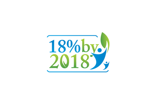
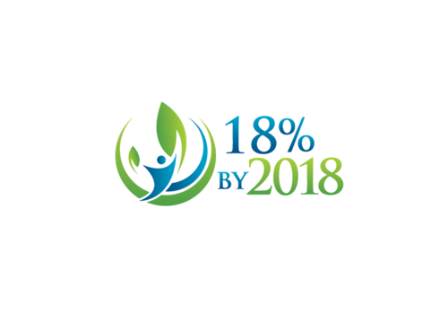
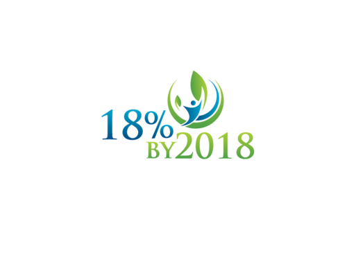
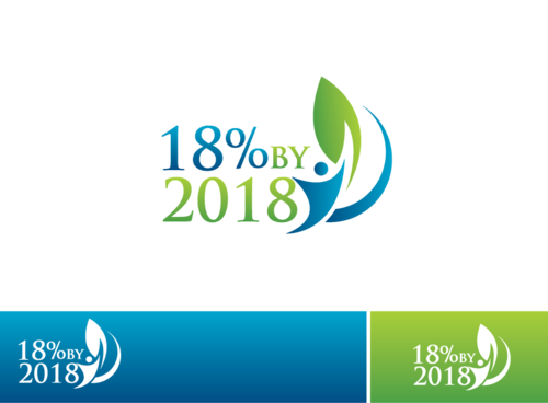
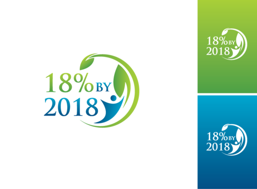
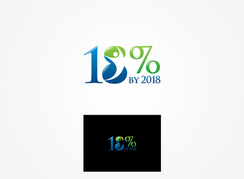
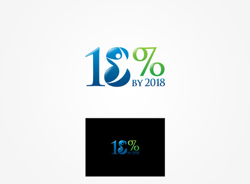
18% by 2018
|
Contest Holder
ilchiro
?
Last Logged in : 485days10hrs ago |
Concepts Submitted
68 |
Guaranteed Prize
199 |
Winner(s) | A Logo, Monogram, or Icon |
|
Live Project
Deciding
Project Finalized

Creative Brief
Logo for vision campaign.
18% by 2018
18% by 2018
No
This logo will be used as a part of our marketing campaign to press our vision: 18% of those that live in Illinois will be chiropractic patients by the year 2018. Our corporate mission envelops a "Natural First" approach to health care, and this campaign will continue that message.
We are not rebranding the logo for our organization, and I have included our corporate logo in the uploaded files. This is a logo specifically designed for our vision campaign (18% by 2018). Although it will be different than our corporate logo, we do not want the logo to conflict or contrast our current logo. Thus, the uploaded file is FYI only and not a sample of what we want.
Many times the new logo will appear in the same publications, emails, website pages, etc. with our corporate logo.
If you would like to see more about our organization and currently utilized design features, please visit www.ilchiro.org.
Health
Logo Type
![]()
Symbolic
![]()
Abstract Mark
![]()
Illustrative
![]()
Modern
Sophisticated
Simple
Professional
The colors should complement the colors of our corporate logo. Many times the two logos will appear in the same publications, emails, etc.
not sure
Although our organization is chiropractic related, please refrain from using "spine" related designs.
Related Contests


