Logo - Online Dermatologist
YoDerm
|
Contest Holder
YoDerm
?
Last Logged in : 5156days10hrs ago |
Concepts Submitted
366 |
Guaranteed Prize
250 |
Winner(s) | A Logo, Monogram, or Icon |
|
Live Project
Deciding
Project Finalized

Creative Brief
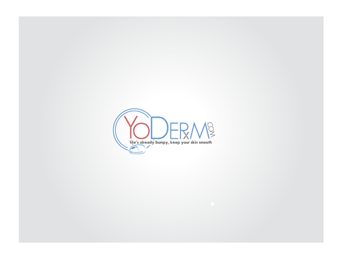
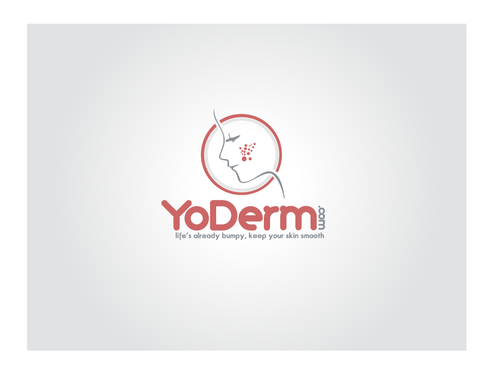
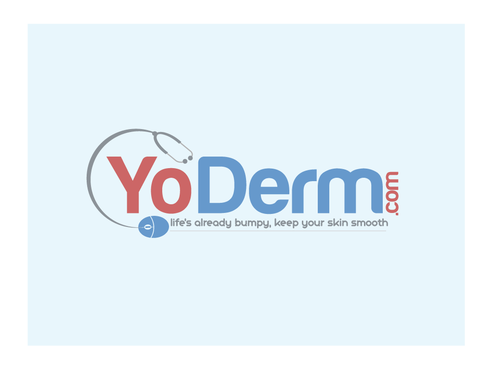
Logo - Online Dermatologist
YoDerm
life's already bumpy, keep your skin smooth
Yes
For a company that supplies online dermatology visits for acne.
Health
Logo Type
![]()
Web 2.0
![]()
Unique/Creative
Clean/Simple
Modern
Industry Oriented
We like calm colors. Here are some samples of colors that we like. 6699CC, CC6666, 9999CC, FFCC99 We are totally open to different colors though. Our company is related to skin so we like colors that resemble skin tones. We also like blues
not sure
The tagline is not mandatory. We will not want it on every logo that we display, so only add the tagline if it can be cropped out.
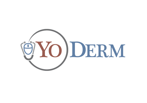
We had an idea about a stethescope that was connected to a computer mouse. This symbolizes online health care.
Another idea is making the R in YoDerm as an Rx prescription symbol
But we trust the creative genius inside of you. Please feel free to take risks and if we like your work, we will have a lot more designs needed down the road.
Related Contests


