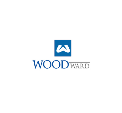
WOODWARD LOGO REVISION
WOODWARD
|
Contest Holder
woodward
?
Last Logged in : 3593days7hrs ago |
Concepts Submitted
59 |
Guaranteed Prize
250 |
Winner(s) | A Logo, Monogram, or Icon |
|
Live Project
Deciding
Project Finalized


Creative Brief
WOODWARD LOGO REVISION
WOODWARD
No
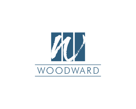
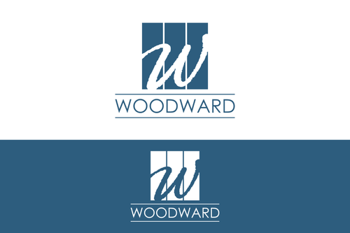
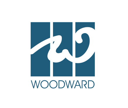
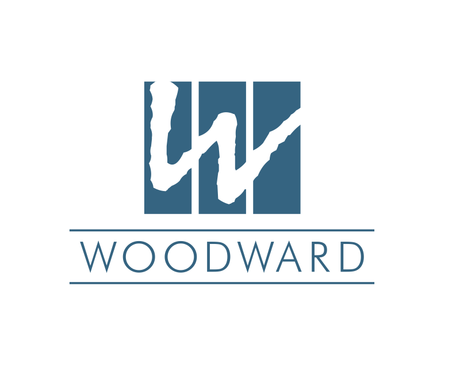
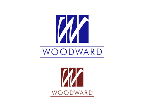
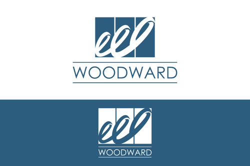
The Woodward Group is a property development corporation. We like what we have, our major issue is the "downward curl" on the end of the "W".
Construction
Initials
![]()
Cutting-Edge
Unique/Creative
Clean/Simple
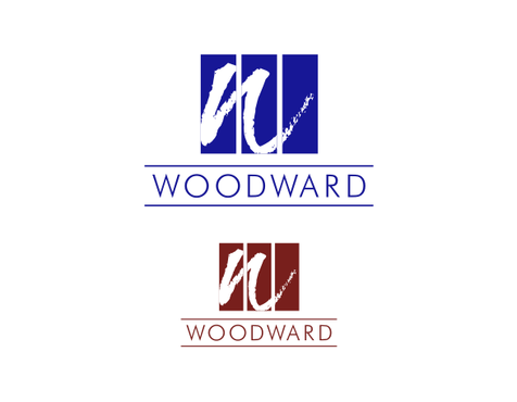
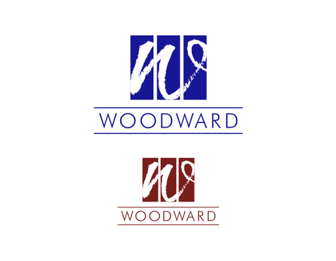
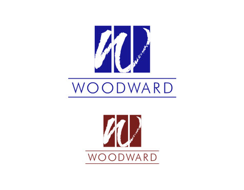
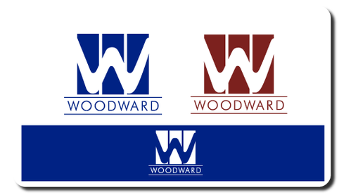
We would like to see the design in two different PMS colors. Not both colors together, the same design with two color options. PMS Reflex Blue or PMS 1815
not sure
Please see the following link: https://docs.google.com/open?id=0B_OzaG01NaA3NGJlMTlmNDgtZDlmOS00MGRmLThjNjgtMjI4YjVmZTkyZmNm
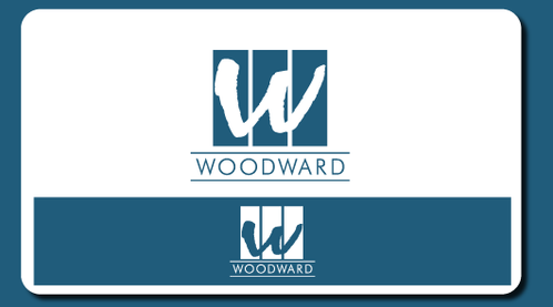
We like this design, the issue is the curl on the end of the W. Also we need a very high resolution logo to blow up for signage.
Related Contests


