Good Friday- Design Worthy or Not?
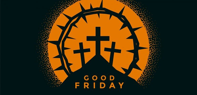
Featured Image: Freepik.com
The industry is saturated with religious design around this time of year and churches and clerics are hiring graphic designers to create logos, posters, event brochures, business cards, and stationary for their church events. It does bring up an interesting point because these clients will be asking for designs focused on Good Friday and Easter. They will all have the same references, and their design briefs will all contain the same information.
For all those who don’t know, Good Friday is a Christian holiday in which Jesus Christ was crucified on the cross with a crown of thorns on his head, to save humanity for their sins, and he died for them. This is powerful imagery that is depicted in statues, paintings, murals, books, and movies, and you can find it all over the world.
As a designer, your challenge is to show off your amazing skills, and let your clients know how much you care about their message. Bring your clients something different from their competitors and let your design speak for itself the intended message to the target audience.
Churches use marketing tools like businesses
Posters for church events are perfect for Good Friday; they are an easy call to action to get the church community to come to the event and be with others. With that in mind, there are several elements that help make an effective poster.
The most important element is the visual. You must take into account the type of audience the poster is supposed to target, the purpose of the poster, and whether or not to use a photograph, an illustration, or both. Don’t forget about the typography! Text should be easy to read and help draw the eye to the poster.
Bert Neal
Follow him: @bertn1984
This one by Bert Neal is a large effective image of the crown of thorns and it looks good both ways in black and white. It’s simple and to the point as a design. The client’s audience will have no confusion about what this event is about.
Rojofoto Design
Follow him: @imrobertjohnson
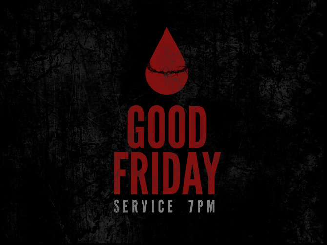
Image Source: Cargocollective/Rojofoto Design
This poster by Robert Johnson is simple, but the imagery of the blood drop wrapped in thorns is unique. The only downside to the blood drop is it may cause some confusion because the thorns wrapped around it aren’t as large as it could be.
What gets people go to an event?
Some churches will hand out programs to remind people that the event is coming up. They can also be used to list what will happen during the Good Friday service. If you’re not working off a template, then you need to discuss with your client about an appropriate format.
Get creative with the format of your event program. Keep in mind typical design elements such as white space, choice of colors, typography, and what material and machine the program will be printed on. This can all affect the design.
Michael Taylor
Follow him: @godserv
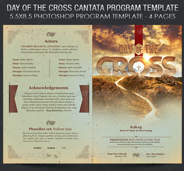
Image Source: Behance/Michael Taylor
Michael Taylor has chosen to use a real image instead of creating a graphic. It does separate him from everyone else on this list! The colors from the image were used to match the rest of the pamphlet, and the word “cross” circling the actual cross in the picture was meant as an inspiration.
Khanh Dang
Follow him: @dangkhanh
The colors match the overall theme of the religious holiday in this design but I wonder if they are too busy for the design. Unlike everyone else, Khanh Dang used an actual crown instead of the crown of thorns. To me, it confuses the imagery of actual royalty with Good Friday. It’s a weird mix.
Logos for holidays can be hit-or-miss
Designing a logo for a specific holiday will only work if the logo also defines the intended client. They are supposed to serve as an instant reminder of a company or a product; and to the client they’re the point of recognition on which their branding hangs.
If you are designing a logo, be sure to remember that you have a huge challenge ahead of you to incorporate the client’s message into one mostly simple graphic.
Luma Vine Creative
Follow Him: Dribbble
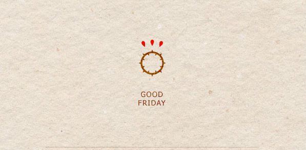
Image Source: Behance/Luma Vine Creative
This is a basic logo, but the simplicity tells you everything you need to know. It has all the design elements of Good Friday – it has thorns; it has blood, but it doesn’t include the cross or depiction of Jesus. This is perfect for a logo, but I wonder can a religious holiday have a “logo”? It doesn’t look like this was designed for anyone in particular.
If every design has the same brief, and the same iconic imagery, have these designers accomplished their challenge and spread their creative wings to give the client something unique?
Do these designs look the same to you?
Let us know below what you think or tweet us @zilliondesigns with your opinion!


