Calorie-counting webpage
Calorie-counting webpage
|
Contest Holder
mue114
?
Last Logged in : 4939days16hrs ago |
Concepts Submitted
58 |
Guaranteed Prize
400 |
Winner(s) | Web Design |
|
Live Project
Deciding
Project Finalized


Creative Brief
Calorie-counting webpage
Calorie-counting webpage
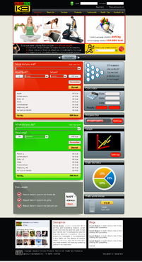
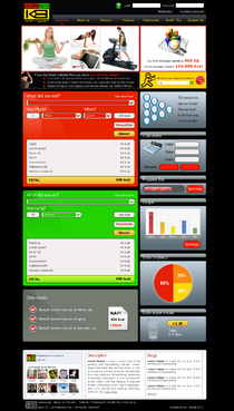
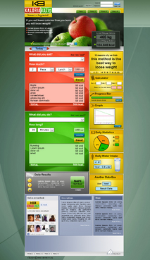
Health
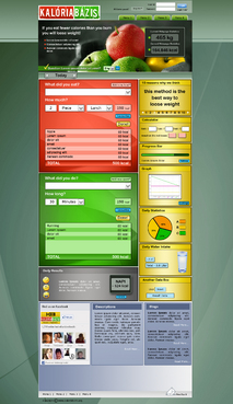
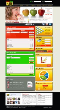
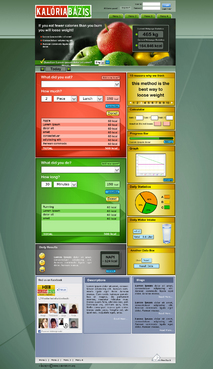
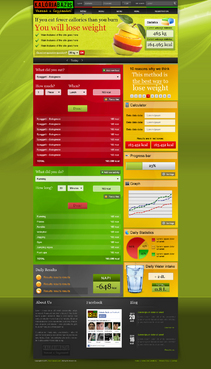
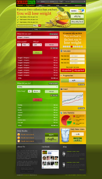
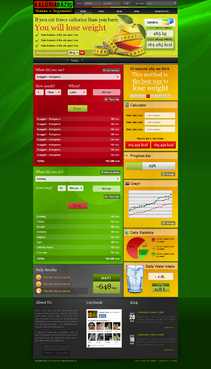
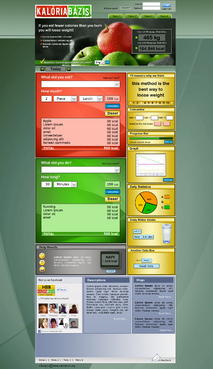
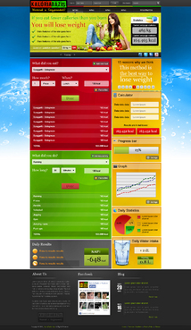
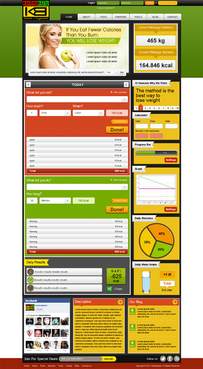
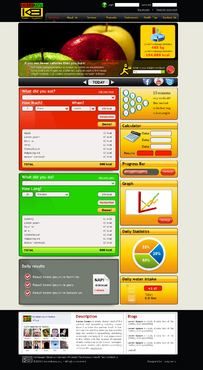
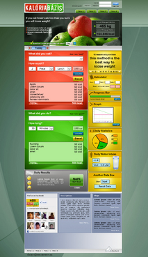
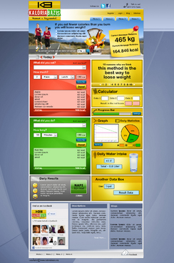
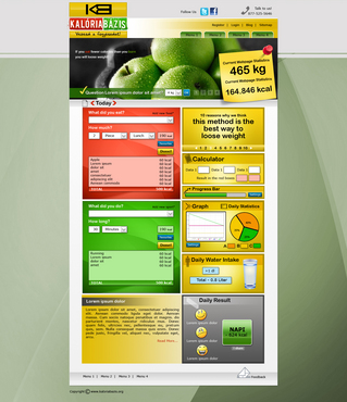
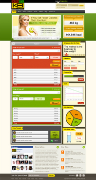
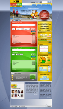
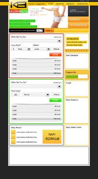
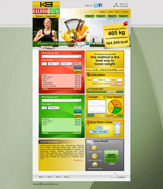
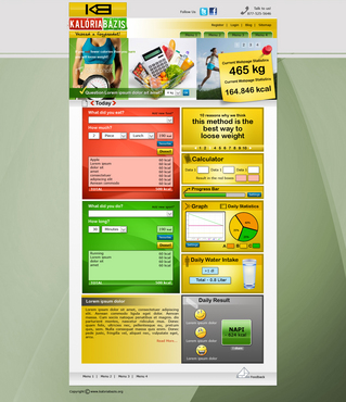
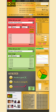
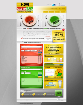
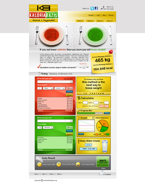
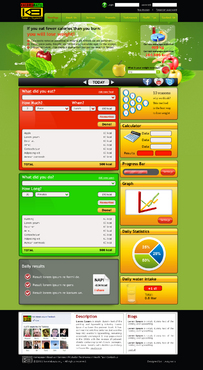
This webpage is going to be a calorie counting webpage in Hungary.
On this website you can add your meals to the calorie intake panel (red box) and you can
add your fitness into the green panel. It shows statistics, graphs, etc.
I dont want to make it look like the other 1 million fitness webpages. I dont want to make the visitors feel like it is an advertisement. We dont want to sell them anything. It's a free nonprofit website. I dont want fancy style. The most important thing is that it should be clearly structured, transparent, very easy to see the elements and read the texts. I want the website to have a professional "calculator machine" feeling, the people should feel that this is a webpage with serious calculators and database, and not another weightloss pill or diet advertising page. You should use fonts which have accents, because it will be a Hungarian webpage with special characters like "éáöüó"
Cutting-Edge
Unique/Creative
Clean/Simple
Professional
Content Driven
Academic
Exciting
Modern
Colorful
Service Oriented
High Tech
Fun
Feminine
red (calorie IN panel)
green (calorie OUT panel)
yellow (right side and header, but its up to you!)
Arial
above header
Please read my full brief (kb_readme.doc)
Related Contests


