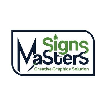
Creative Logo for the "Signs Masters" Sign Printing Shop
Signs Masters
|
Contest Holder
andreybond
?
Last Logged in : 4293days13hrs ago |
Concepts Submitted
140 |
Guaranteed Prize
200 |
Winner(s) | A Logo, Monogram, or Icon |
|
Live Project
Deciding
Project Finalized


Creative Brief
Creative Logo for the "Signs Masters" Sign Printing Shop
Signs Masters
Creative Graphics Solution
Yes
Creativity and professionalism in the vinyl signs and graphics business.
Printing
Symbolic
![]()
Abstract Mark
![]()
Illustrative
![]()
Modern
Cutting-edge
Sophisticated
Professional
High Tech
Bright Green (57c40f); Dark Blue (00133e); Black; White.
not sure
“Signs Masters” is a new vinyl sign cutting and printing company. We make banners, posters, window signs, decals etc. We are looking for a memorable and creative logo that would stand out.
Any shape is involved it need to be unique. The logo should be visible and readable for the most part whether it is seen small or large. It also has to be able to be black and white as easy as it can be seen in color.
Please use following colors (in any combination) Bright Green (57c40f); Dark Blue (00133e); Black; White.
Related Contests