SALES / SUPPORT : +1-877-525-5646   |  


CrossFit North Chicago

CrossFit North Chicago

Contest Holder crossfitnc ?

Last Logged in : 3983days21hrs ago

Concepts Submitted

122

Guaranteed Prize
275
Winner(s)

1

A Logo, Monogram, or Icon veildAll design entries can be viewed by other designers. Featured Featured Contest
tick_gray

Live Project

tick_gray

Deciding

tick_blue

Project Finalized


Project: CrossFit North Chicago
Industry: Sports Logo
Contest Launched: Jul 14, 2011
Selected: 1 winning design from 122 concepts
Winning Design by: qcssoft
Close Date: Jul 25, 2011


CrossFit North Chicago - Sports


Awarded as a winner
Project Report    

Sort by:


#116

#111

#59

#58

#20

#19


Creative Brief


CrossFit North Chicago

CrossFit North Chicago

No

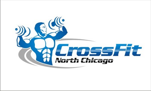
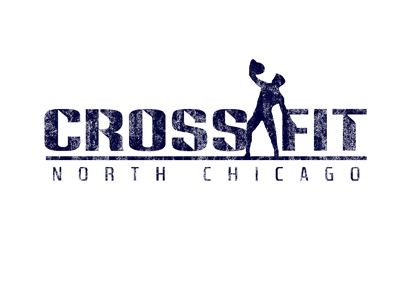
This is about CrossFit. A strength and conditioning progam that is constantly varied and incorporates functional movements that are performed at high intensity. Please see CrossFit.com to learn more. You can also check out http://www.crossfit.com/cf-affiliates/ and go to the other affiliate websites to see the trends.

Sports

Logo Type
Logo Type

Symbolic
Symbolic

Abstract Mark
Abstract Mark

Web 2.0
Web 2.0


Cutting-Edge
Unique/Creative
Modern
Industry Oriented
Abstract

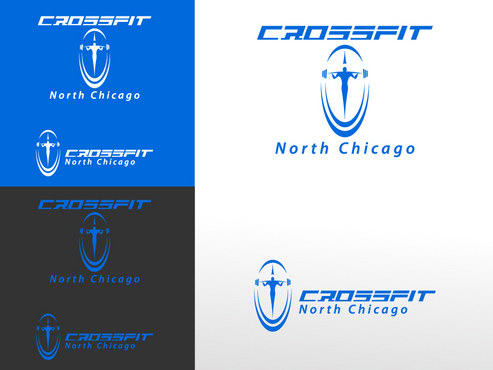
Blue, Dark Gray/Silver, Black

not sure

There are a few different directions this could go.

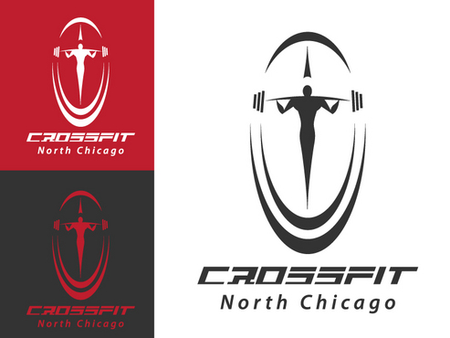
One direction to go is to use a figure similar to (but obviously not the same one) the one in this logo http://www.cihp.com/ but to have it lifting a barbell, dumbbell, kettlebell, or flipping a tire. Would love to see a couple of each if possible.

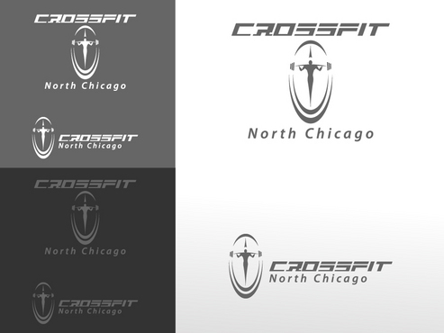
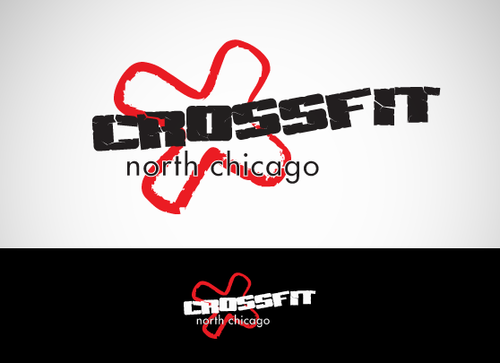
Another direction to go is to use the above mentioned equipment and just incorporate them into the business name without a figure. For example the equipment could be stacked up leaning against each other on the side of the name or somehow incorporated within the letters or leaning up against the letters. (Not all of the equipment listed above would necessarily have to be used)

I am also open to other original ideas as long as it represents fitness and looks cool!

Related Contests


Logo for a unique soccer training program
$200
Prize Money
36
Concepts
Logo for apparel line
$250
Prize Money
273
Concepts
Spartan Karate Logo
$199
Prize Money
54
Concepts
Hip Logo for Running Website
$200
Prize Money
98
Concepts

Discussion


Comments

  • July 25, 2011 7:07 AM
    dynamikdezyn dynamikdezyn
     
    qcssoft did you see the logo #60? obviously you did :)

    Like Icon 0   DislikeIcon 0
  • July 24, 2011 12:32 AM
    designXtreme designXtreme
     
    Any feedback or star ratings will be highly appreciated. Thanks,

    Like Icon 0   DislikeIcon 0
  • July 21, 2011 10:52 PM
    crossfitnc crossfitnc
      Project Holder
    Due to the great designs that are being presented we need more time to evaluate. Project has been extended!

    Like Icon 0   DislikeIcon 0
  • July 19, 2011 2:18 PM
    crossfitnc crossfitnc
      Project Holder
    #24 we like much about the logo (like shading and use of colors) except the bodybuilder type image. Maybe try a different type of image?

    Like Icon 0   DislikeIcon 0
  • July 19, 2011 1:58 PM
    crossfitnc crossfitnc
      Project Holder
    Hi designers. Thanks for all the ideas you have put up. I am quite impressed overall. I have been getting lots of feedback so here are the thoughts. Any that look like bulky bodybuilders will need to go because we are an overall fitness gym, not a bodybuilding gym. Any others that are eliminated just weren't particularly high on anybody's list. Any that are not eliminated we like and are still evaluating. #13 is really cool but the business name is a bit small. #19 is the overall favorite of many so far. We would like to see some other colors such as the gray and blue mentioned in the brief! Also could you try situating the name and image differently, such as CrossFit above and North Chicago below. And also one with the image to the left of the business name.

    Like Icon 0   DislikeIcon 0