exam success logo
Exam Success
|
Contest Holder
examsuccess
?
Last Logged in : 5115days16hrs ago |
Concepts Submitted
107 |
Guaranteed Prize
149 |
Winner(s) | A Logo, Monogram, or Icon |
|
Live Project
Deciding
Project Finalized


Creative Brief
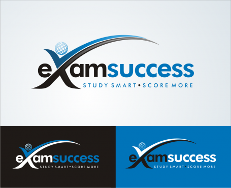
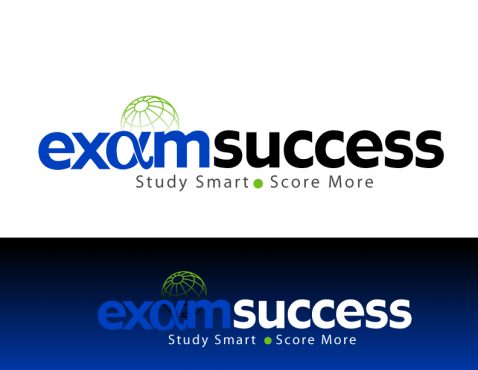
exam success logo
Exam Success
Study Smart. Score More.
Yes
The tag line is our company’s promise. Exam Success’ unique teaching approach (an exam critical content focus and personalized expert exam prep coaching), prepares students to study and write exams more efficiently and effectively putting them in a favorable position to Score More not only on their tests, but also professionally in their careers.
Exam Success is a well respected test preparation service provider dedicated to satisfying the academic and practical training needs of candidates pursuing various financial services industry professional designations such as CFA, NASD series 6,7…, CFP. Exam success provides customized in-class, on-line and distance learning programs as well as personal coaching, mock exams, practice exam questions.
Education
Logo Type or web 2.0 or both
![]()
2 - Black and Blue, Black and Green. Ideal blues and greens will be those with stronger tones with a hue in the middle to dark range.
1. Prefer a san serif font such as Veranda, Futura 2. Logo should be on a white background. 3. See Maxmix's LesleyRusso logo and HexArt's ExceedMedia logo for colour direction. Stronger tones than these would be more favorable than lighter. 4. HexArt’s ExcecedMedia logo and intergration of tag line is 5. Use a non-serif font like Veranda or Futura. Ideas that you might consider for the design: a) Visually conveying the tag line/slogan promise.. b) Using the knowledge triangle as part of the design The Knowledge Triangle: http://en.wikipedia.org/wiki/Knowledge_triangle. The knowledge triangle refers to the interaction between research, education and innovation, which are key drivers of a knowledge-based society. c) other suggestions you have?
Related Contests