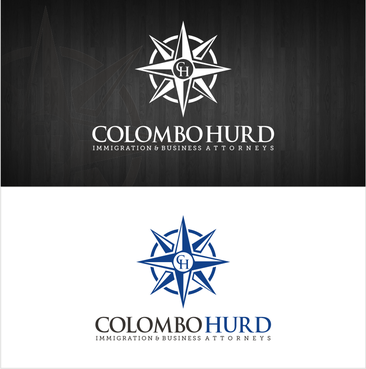
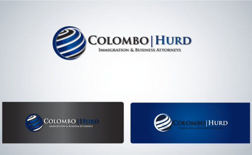
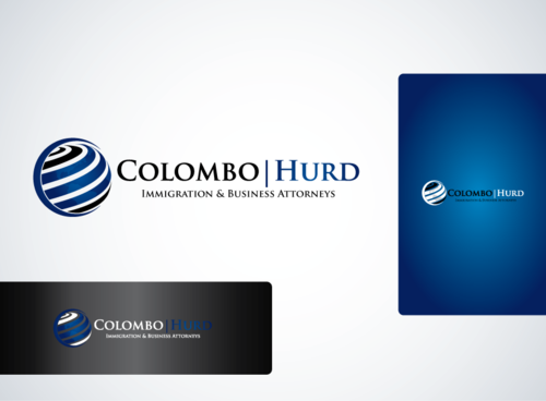
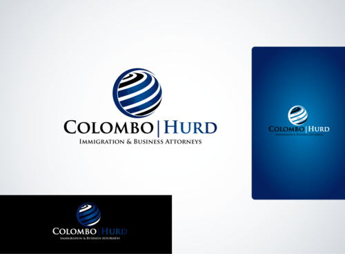
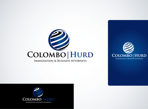
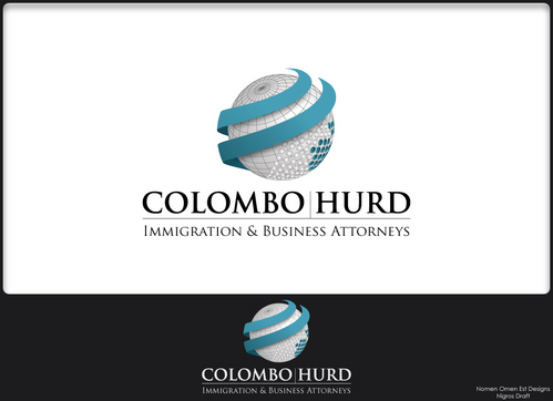
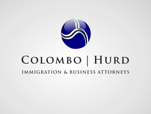
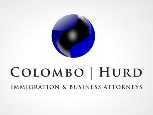
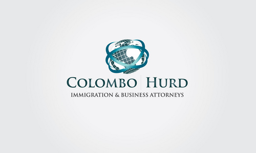
Immigration Law Firm Logo
Colombo | Hurd
|
Contest Holder
chblaw
?
Last Logged in : 4997days21hrs ago |
Concepts Submitted
119 |
Guaranteed Prize
315 |
Winner(s) | A Logo, Monogram, or Icon |
|


Creative Brief
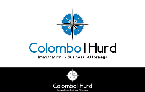
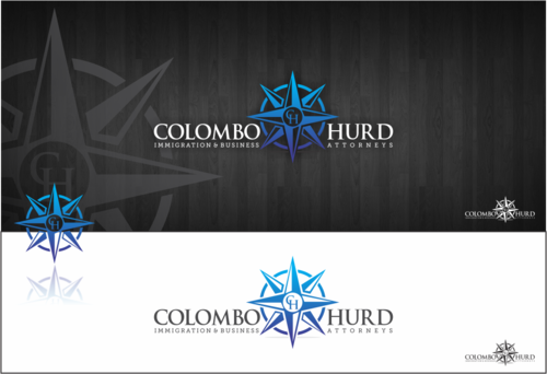
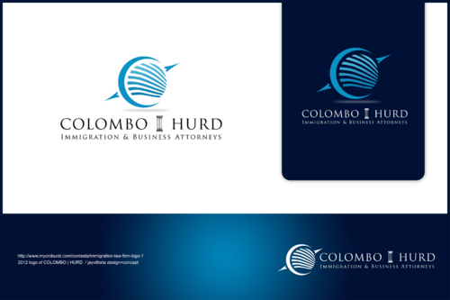
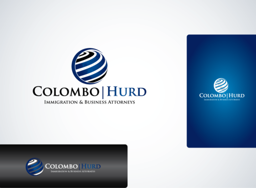
Immigration Law Firm Logo
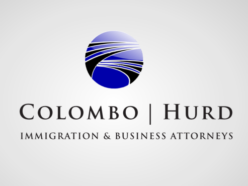
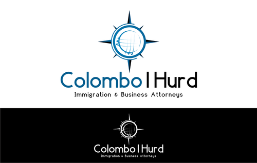
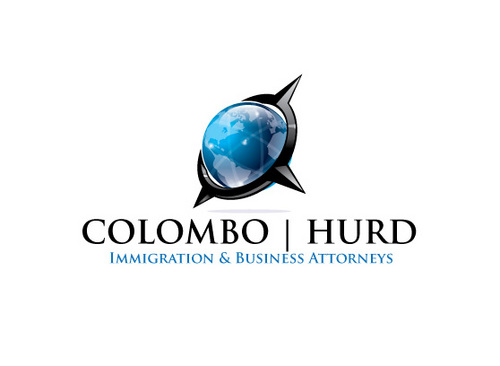
Colombo | Hurd
Immigration & Business Attorneys
Yes
Immigration law firm serving individuals and businesses with U.S. immigration law.
Law
Symbolic
![]()
Unique/Creative
Clean/Simple
Sophisticated
Industry Oriented
High Tech
Black, Blue & whatever you think.
not sure
We generally like the font and text we've uploaded here but think we need a much better icon. Would like to go with either a globe or compass of some sort and possibly place it over the firm name rather than to the left. Really looking for something creative & cool yet professional.
Related Contests