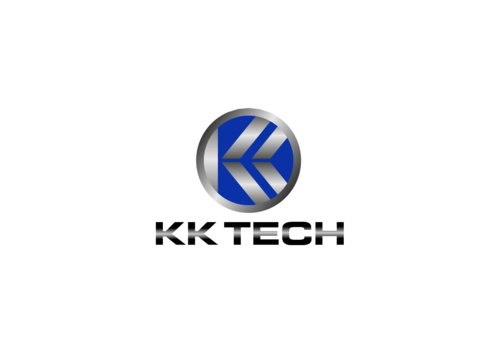
KK Technologies, Inc. Business Logo
KK Tech
|
Contest Holder
kktech
?
Last Logged in : 5511days8hrs ago |
Concepts Submitted
139 |
Guaranteed Prize
200 |
Winner(s) | A Logo, Monogram, or Icon |
|
Live Project
Deciding
Project Finalized


Creative Brief
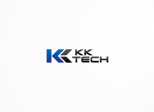
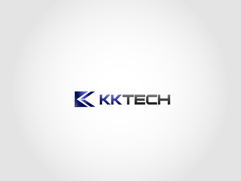
KK Technologies, Inc. Business Logo
KK Tech
No
KK Technologies, Inc. is a global designer and manufacturer of proprietary, high performance contacts for testing semiconductor devices. Our customers are the global leaders in the technology/semiconductor industry such as Intel, Samsung, Apple, etc. We have a patented contact technology that provides superior electrical and mechanical performance at a fraction of the cost of our competitors. We are the best cost/performance in the market.
Electronics
Abstract Mark
![]()
Cutting-Edge
Unique/Creative
Clean/Simple
Sophisticated
Corporate
High Tech
not quite sure, blues, blacks golds....
2
Related Contests