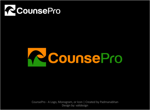
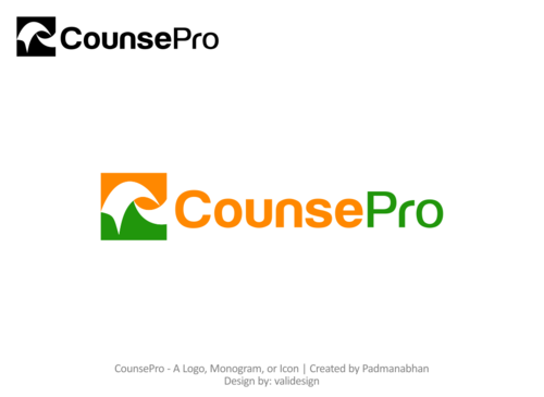
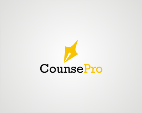
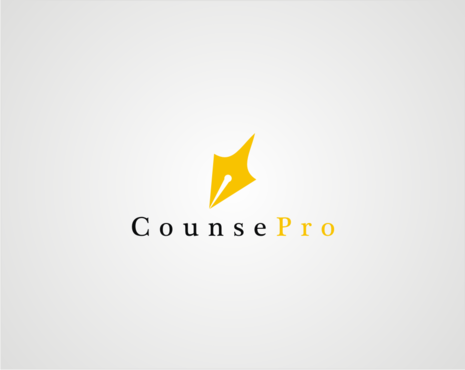
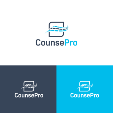
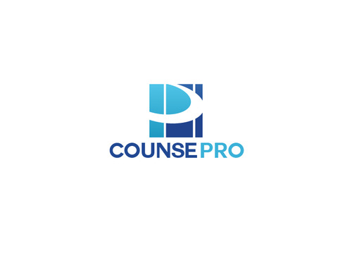
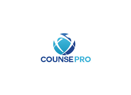
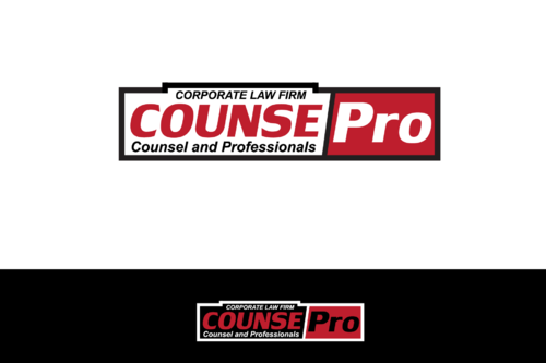
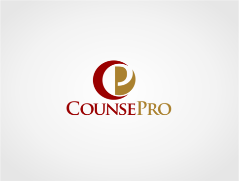
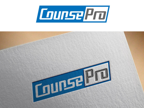
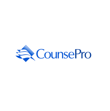
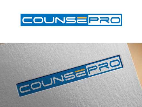
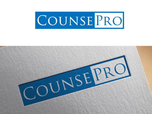
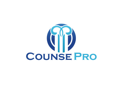
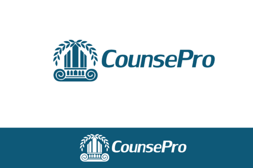
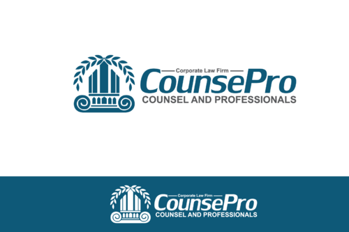
Logo for a corporate law firm.
CounsePro
|
Contest Holder
Padmanabhan
?
Last Logged in : 2188days22hrs ago |
Concepts Submitted
158 |
Guaranteed Prize
250 |
Winner(s) | A Logo, Monogram, or Icon |
|
Live Project
Deciding
Project Finalized


Creative Brief
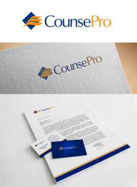
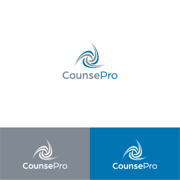
Logo for a corporate law firm.
CounsePro
No
1. This is a modern law firm run by professionals with industry experience
2. The firm is headquartered in Bangalore, India - the Silicon Valley of the East with offices across India.
3. Primary focus of the firm will be to provide legal services to corporate clients needing support on corporate commercial transactions and others.
4. The logo should contain the coined word "CounsePro" in stylized form as well as a symbol.
5. The word "CounsePro" is a registered trade mark and also domain name counsepro.com is registered by us.
6. The word "CounsePro" is coined from the words "Counsel" and "Professionals" to mean that we provide professional legal counsel to our clients. Hence, the letters "C" and "P" MUST be in upper case.
7. The logo SHOULD NOT have the following images: a. scales of justice; b. mallet; c. lady of justice.
Law
Symbolic
![]()
Abstract Mark
![]()
Modern
Cutting-edge
Professional
We prefer to have at least one bright color, which is trendy. However, though we prefer to have two colours, if in the context of the design you create, should you add in a touch of a third color, we will consider that design too.
2
As explained in detail above.
Related Contests