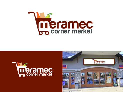
Logo for a country store
Meramec Corner Market
|
Contest Holder
trski617
?
Last Logged in : 4483days2hrs ago |
Concepts Submitted
105 |
Guaranteed Prize
200 |
Winner(s) | A Logo, Monogram, or Icon |
|
Live Project
Deciding
Project Finalized


Creative Brief
Logo for a country store
Meramec Corner Market
No
Small country convenience store selling the typical fare; fuel, beer, cigarettes, soft drinks, camping supplies and other sundries. Located near Meramec State Park in the woods of Missouri on Highway 185.
Logo to be used for signage in front of the store, small billboards, flyers/coupons to be passed out and possibly business cards. Will also be used on Facebook, Linked In, etc...
Retailers
Logo Type
![]()
Symbolic
![]()
Abstract Mark
![]()
Initials
![]()
Web 2.0
![]()
Traditional
Simple
Rustic
No preference...
not sure
Related Contests