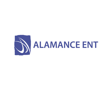
Logo for a Medical Office
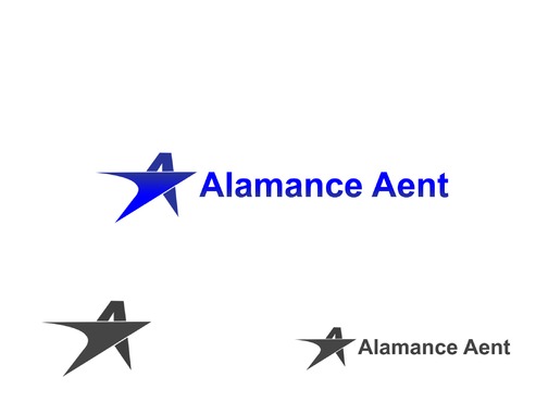
Alamance ENT or AENT (or none...see below)
|
Contest Holder
AlamanceENT
?
Last Logged in : 4407days21hrs ago |
Concepts Submitted
115 |
Guaranteed Prize
250 |
Winner(s) | A Logo, Monogram, or Icon |
|
Live Project
Deciding
Project Finalized


Creative Brief
Logo for a Medical Office
Alamance ENT or AENT (or none...see below)
No
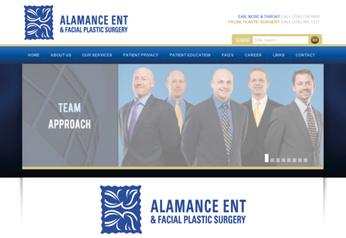
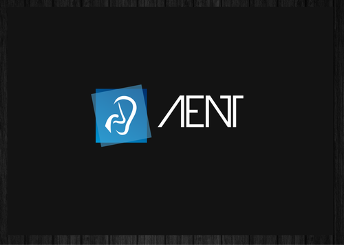
This logo is for an Ear, Nose & Throat doctor's office. It is used a lot by the audiology department in marketing for our hearing aid business. We are replacing our logo because a partner is leaving and taking it with him. You can see our current logo at www.alamance-ent.com. Our current logo is just a symbol without text. We would like a similar concept.
Incorporating the "A" for Alamance or our letters AENT would be fine as well.
Ideally we would like something that we can just insert in the place of our current logo - which is on all of our stationary, brochures, etc.
Medical
Symbolic
![]()
Abstract Mark
![]()
Initials
![]()
Simple
Professional
Blue
2
Please do not include anything like a mortar and pestle or a caduceus or a medical/hospital cross. No stethoscope.
Related Contests