Logo for insurance agency
Stonehenge Insurance
|
Contest Holder
kweeks
?
Last Logged in : 4689days23hrs ago |
Concepts Submitted
189 |
Guaranteed Prize
200 |
Winner(s) | A Logo, Monogram, or Icon |
|
Live Project
Deciding
Project Finalized


Creative Brief
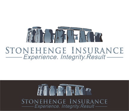
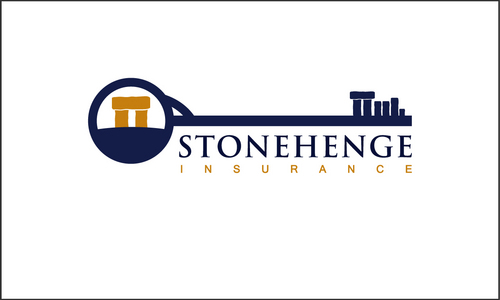
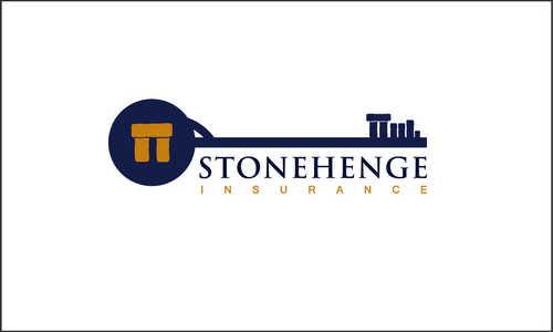
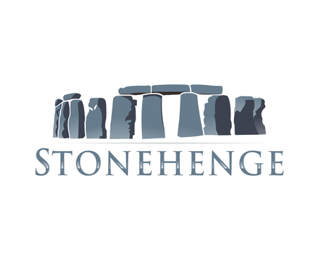
Logo for insurance agency
Stonehenge Insurance
Experience. Integrity. Results.
Yes
trustworthiness, enduring, exclusivity
Financial Services
Masculine
Simple
Professional
Blue
not sure
We would like to incorporate a logo, our name, and tagline but think including all of them may be a lot for one design. We hope to see different examples that include some of these elements and all elements to help us make a good decision. We are hoping for something much different than our current logo seen here: stonehengeis.com
Related Contests