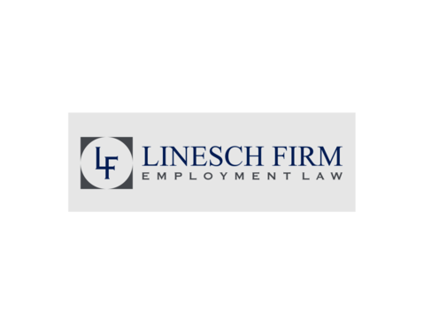
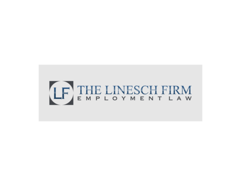
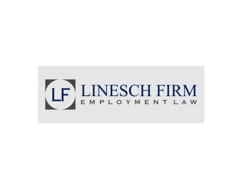
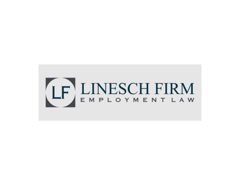
Modern Re-branding For Law Firm
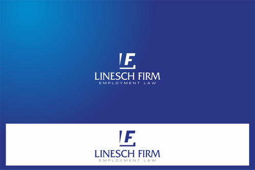
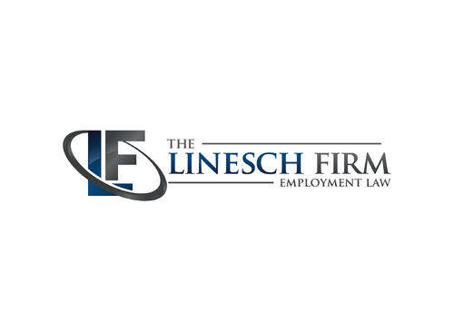
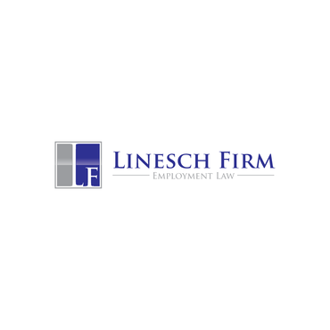
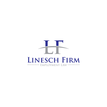
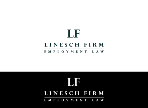
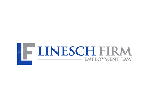
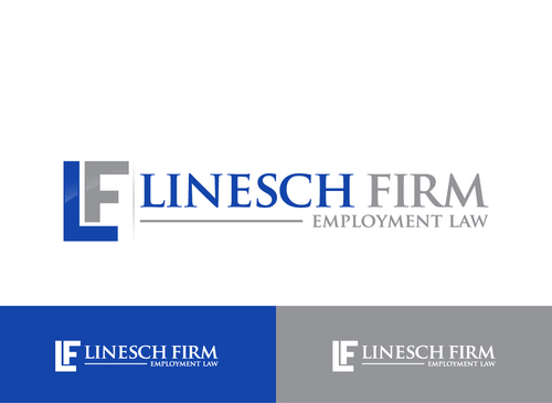
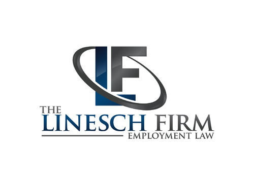
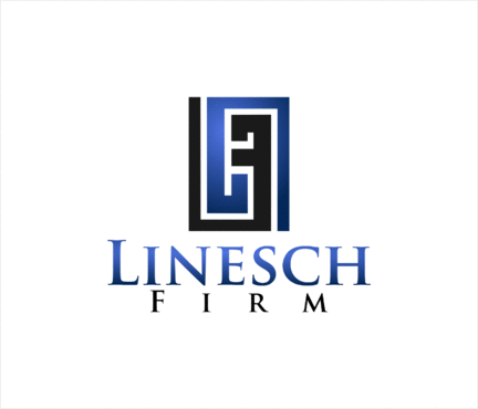
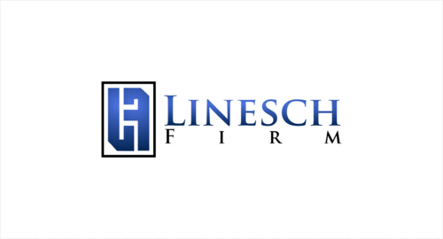
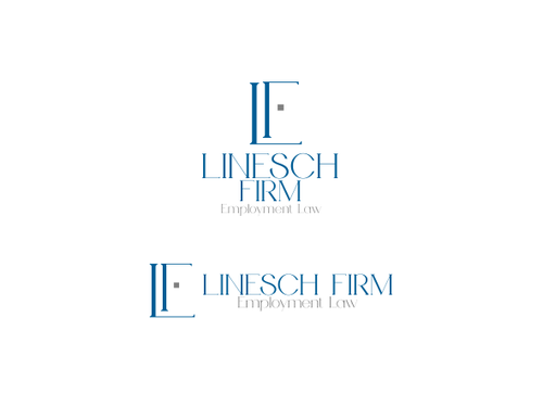
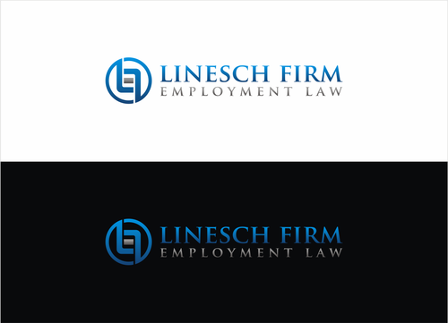
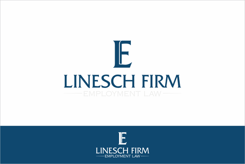
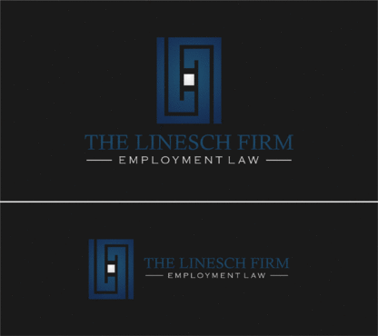
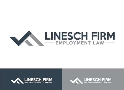
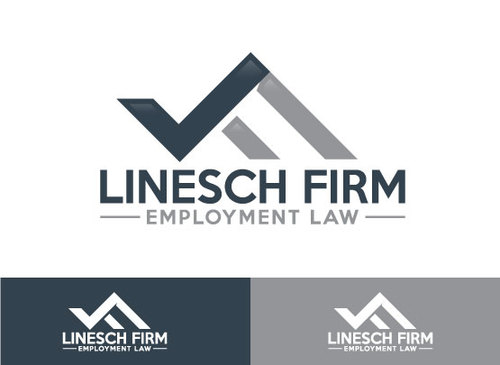
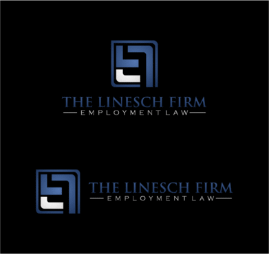
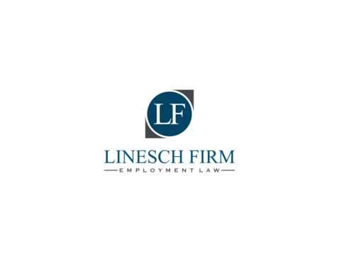
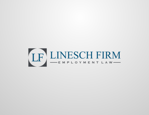
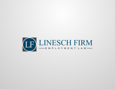
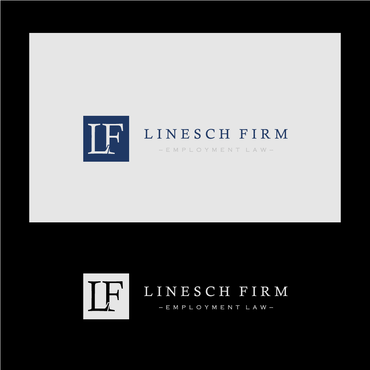
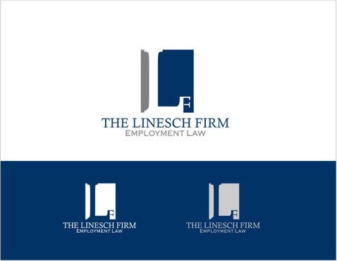
The Linesch Firm or just Linesch Firm
|
Contest Holder
laborlaw
?
Last Logged in : 1910days11hrs ago |
Concepts Submitted
162 |
Prize Money
199
|
Winner(s) | A Logo, Monogram, or Icon |
|
Live Project
Deciding
Project Finalized

Creative Brief
Modern Re-branding For Law Firm
The Linesch Firm or just Linesch Firm
Employment Law
Yes
We are in the process of re-branding our Law Firm. We currently have a website that is also being re-built. Our current website is www.lineschfirm.com. We are looking to change up our main colors as well to a midnight Blue and a Steel grey or potentially other colors. We want to have a modern but clean look to our logo. We liked https://s-media-cache-ak0.pinimg.com/564x/b3/72/85/b3728517ca095418932d18718195e726.jpg how this sample integrated the logo throughout. We want to make sure that the logo can be integrated with the website and stationary.
Law
Logo Type
![]()
Abstract Mark
![]()
Initials
![]()
Web 2.0
![]()
Modern
Cutting-edge
Sophisticated
Simple
Professional
We are looking to change up our main colors as well to a steel midnight Blue and a Steel grey or potentially other colors. We want to have a modern but clean look to our logo. We like the traditional, with modern elements factored into it. We have toyed with a distressed stone backslash but have had some problems incorporating it into our stationary, that is why we are trying out new ideas. See attached in file uploads.
not sure
https://s-media-cache-ak0.pinimg.com/564x/b3/72/85/b3728517ca095418932d18718195e726.jpg
http://www.mycroburst.com/drafts/display/contest/153763/draft/1179879
Related Contests