Pivotpoint
PivotPoint Law
|
Contest Holder
BYLee
?
Last Logged in : 5591days22hrs ago |
Concepts Submitted
158 |
Guaranteed Prize
350 |
Winner(s) | A Logo, Monogram, or Icon |
|

Creative Brief
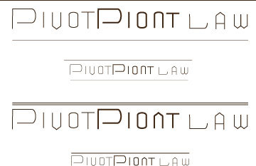
Pivotpoint
PivotPoint Law
No
We are a boutique law firm that specializes in restrucuring and insolvency law. We are based in Silicon Valley but serves clients all over the country.
Law
Logo Type
![]()
Symbolic
![]()
Abstract Mark
![]()
Clean/Simple
Sophisticated
Corporate
Modern
High Tech
Serious
None, but not too colorful. We are a law firm after all.
not sure
I am somewhat stuck to the idea of a triangle pointing downward.
Related Contests