PREMIER REDESIGN
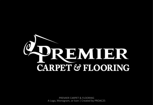
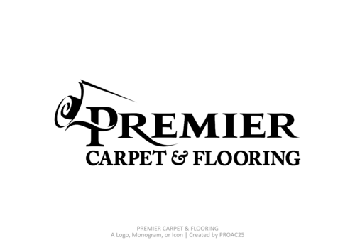
PREMIER CARPET & FLOORING
|
Contest Holder
PROAC25
?
Last Logged in : 3371days23hrs ago |
Concepts Submitted
52 |
Guaranteed Prize
249 |
Winner(s) | A Logo, Monogram, or Icon |
|
Live Project
Deciding
Project Finalized

Creative Brief
PREMIER REDESIGN
PREMIER CARPET & FLOORING
remove current tag line-its being retired-no tag line
No
PREMIER CARPET & FLOORING
Mid to high end floorcovering specialty dealer/
retail
logo to be used everywhere including print ads, web, cards, merchandising materials etc.
www.premiercarpetandfloor.com
Retailers
Logo Type
![]()
Cutting-Edge
Sophisticated
black/ darker red /yellowish gold gradient colors are not preferered
2
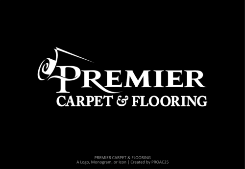
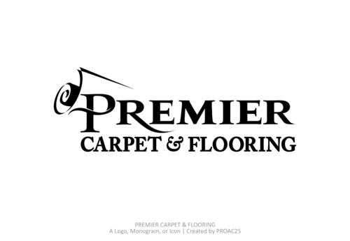
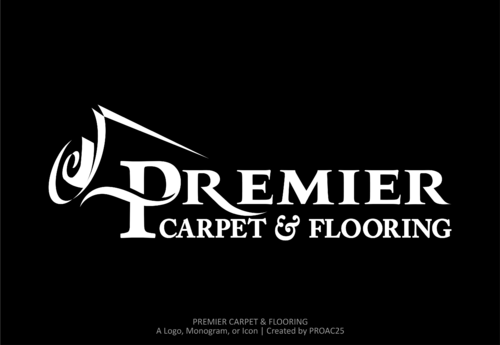
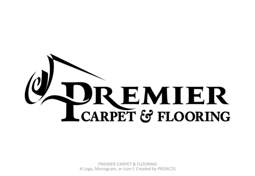
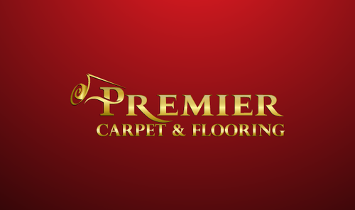
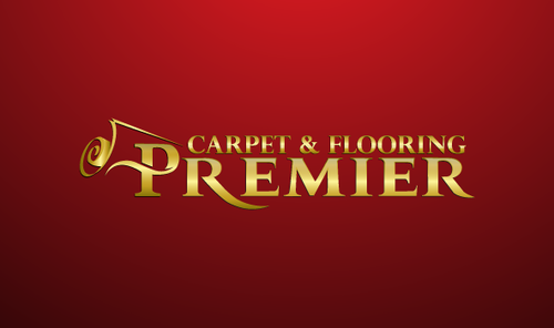
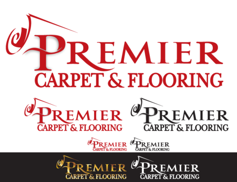
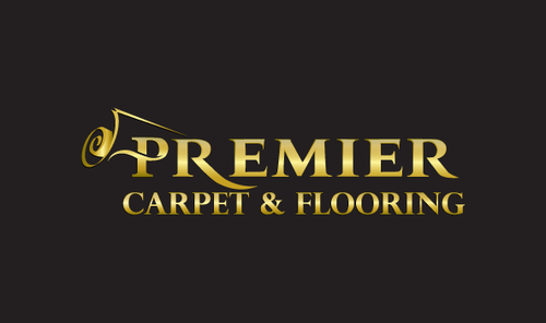
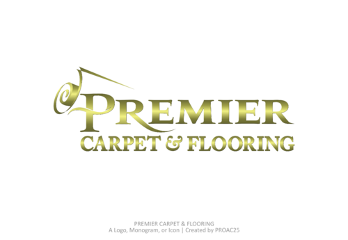
The current logo in use we like but the primary problem is the carpet & flooring is to small.
Needs to be balanced with the PREMIER. The carpet & flooring gets lost and not visable well in print when made smaller scale. The stylized P and the element are good and we would like to keep that idea BUT---******
The font type that is used is also proving to be TOO THIN, logo needs a font type that is thicker in a similar 'perpetual' style of font. Ok to try different color combinations so long as reds/black/gold.
would like to see in black and white as well, logo in black and white is criticle for much of our advertising needs. can see logo at www.premiercarpetandfloor.com
remove tag line-logo will be without a tag line-remive registration mark.
Related Contests