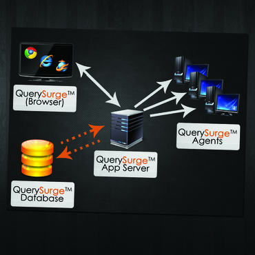
Modern Architecture Diagram for Data Warehouse Testing Software
The QuerySurge Architecture
|
Contest Holder
lpoggi
?
Last Logged in : 4809days10hrs ago |
Concepts Submitted
20 |
Guaranteed Prize
250 |
Winner(s) | Marketing collateral |
|
Live Project
Deciding
Project Finalized


Creative Brief
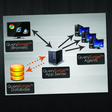
Modern Architecture Diagram for Data Warehouse Testing Software
The QuerySurge Architecture
Information Technology
Corporate, technical, modern
Please keep the graphic as simple as possible, we are open to new ideas and prefer that the icons are clean and simple, and have a similar look. There are no particular dimensions. The diagram has to be clearly viewed on a website and on printed sales materials (8.5’’ x 11’’ sheet of paper) .
Related Contests


