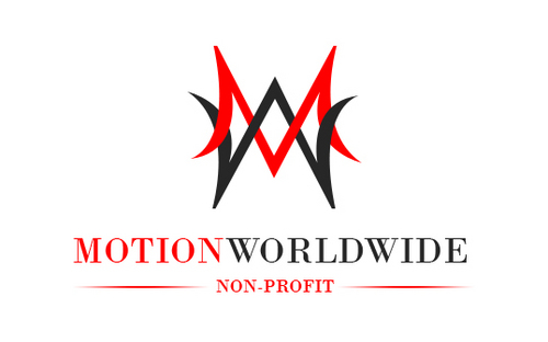
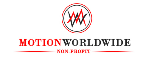
Non-Profit Logo Design
MW Motion Worldwide
|
Contest Holder
100PERCENT365
?
Last Logged in : 5264days15hrs ago |
Concepts Submitted
181 |
Guaranteed Prize
149 |
Winner(s) | A Logo, Monogram, or Icon |
|
Live Project
Deciding
Project Finalized

Creative Brief
Non-Profit Logo Design
MW Motion Worldwide
Non-Profit
Yes
Athletic training fundraisers for athletes around the world
Sports
Illustrative
![]()
Unique/Creative
Illustrative
Black, Red, White, but mostly Black
3
I like the idea of having an M and W intertwine to form a symmetrical symbol like the New York Yankees Logo. Something that is unique and also adds an element of motion. However, the MW is the most important element of the logo.
Related Contests