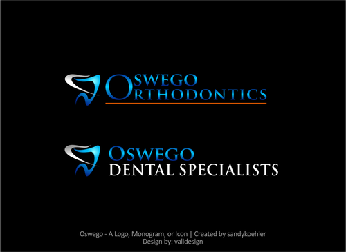
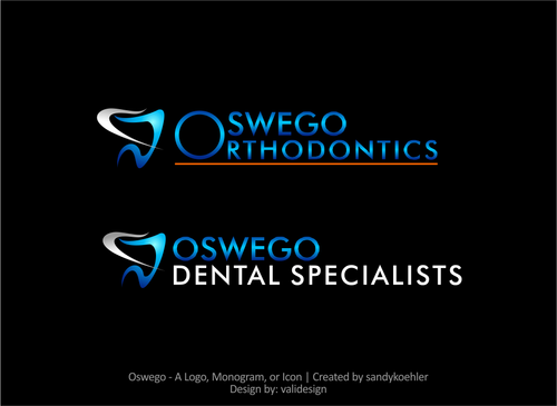
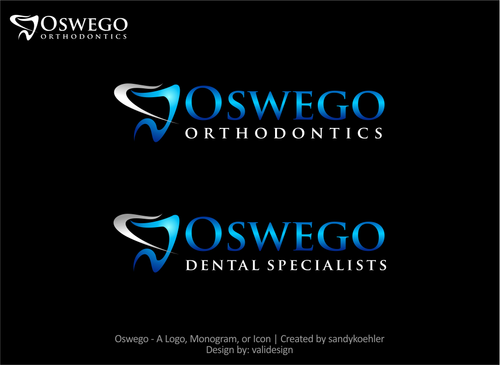
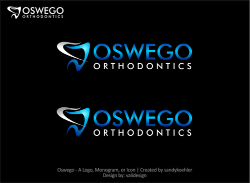
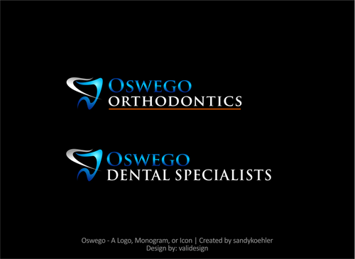
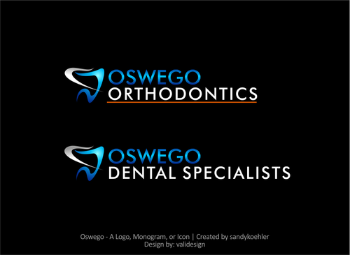
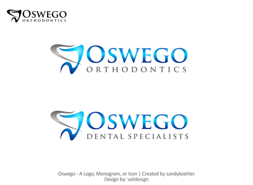
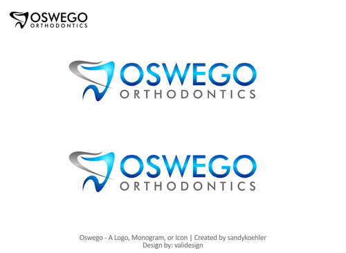
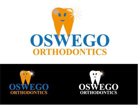
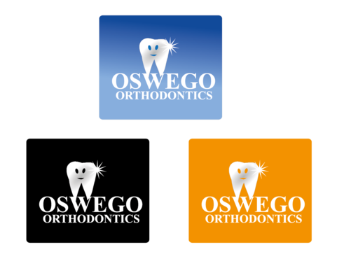
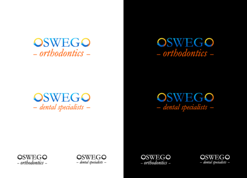
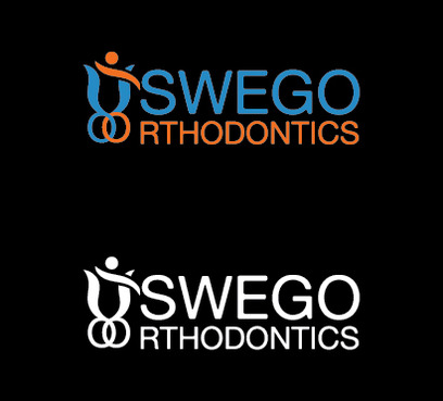
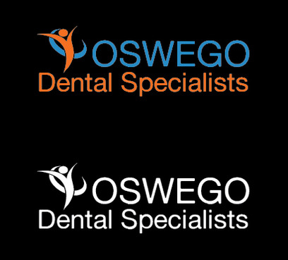
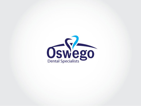
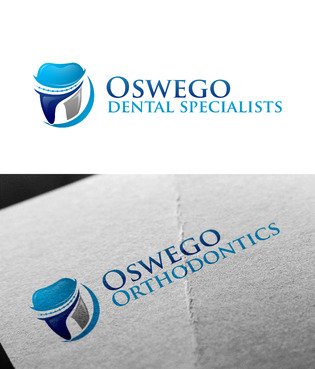
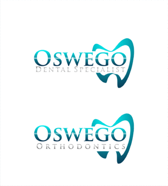
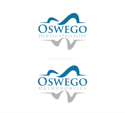
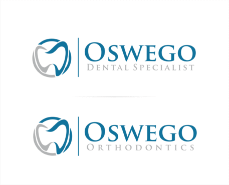
SALES / SUPPORT : +1-877-525-5646   |  


Oswego

"Oswego Orthodontics" and "Oswego Dental Specialists"

Contest Holder sandykoehler ?

Last Logged in : 3374days23hrs ago

Concepts Submitted

297

Guaranteed Prize
300
Winner(s)

1

A Logo, Monogram, or Icon veildAll design entries are veiled from other designers till the end of the contest. Featured Featured Contest
tick_gray

Live Project

tick_gray

Deciding

tick_blue

Project Finalized


Project: Oswego
Industry: Medical Logo
Contest Launched: Oct 15, 2014
Selected: 1 winning design from 297 concepts
Winning Design by: validesign
Close Date: Jan 14, 2015


Oswego  - Medical


Awarded as a winner
Project Report    

Sort by:


#177

#176

#175

#171

#170

#167

#166

#165

#158

#157

#156

#155

#151

#139

#138

#137

#136

#135

#132

#115

#76

#75


Creative Brief


Oswego

"Oswego Orthodontics" and "Oswego Dental Specialists"

Yes

Logo for new orthodontic office and dental specialist office. Both logos should be similar in color and style just different text.

Medical

Logo Type
Logo Type


Cutting-edge
Sophisticated
Professional
High Tech

blue, silver, white, orange

not sure

Related Contests


Logo for a MILITARY CHILDREN'S HOSPITAL
$350
Prize Money
115
Concepts
Logo for surgical practice/clinic
$200
Prize Money
33
Concepts
Logo for a Medical Marijuana Collective
$350
Prize Money
256
Concepts
Logo for Medical Device Company
$200
Prize Money
125
Concepts

Discussion


Comments

  • November 08, 2014 10:35 AM
    soulafella soulafella
     
    In my humble opinion : - This contest has start from 16 oct and hasn't end until now? Why don't you just choose the winner and revision the design as you wish outside this contest? rather than wait for the contest end (that makes the designer see each other design) and then you extend the contest again? - I just feel sorry for the designer who already give their mind and time, i see some designer already have a couple revision and it doesn't make them be the winner. Instead you extend the contest looking for other design. - I see some of them already get a four star rated...so what are you waiting for? :)

    Like Icon 2   DislikeIcon 0
  • October 21, 2014 6:24 PM
    sandykoehler sandykoehler
      Project Holder
    Draft #116 could you change the silver to orange to compare and see the difference please

    Like Icon 0   DislikeIcon 0
  • October 21, 2014 6:16 PM
    sandykoehler sandykoehler
      Project Holder
    Draft #106, can we make the O blue and "swego" and "rthodontics" white please? Oswego is hard to read... Also, can you show that with the white background version too please?

    Like Icon 0   DislikeIcon 0
  • October 18, 2014 2:43 PM
    sandykoehler sandykoehler
      Project Holder
    and make Oswego smaller for both dental and ortho please

    Like Icon 0   DislikeIcon 0
  • October 18, 2014 2:42 PM
    sandykoehler sandykoehler
      Project Holder
    so draft #96 and #97 with orange in the art and underline dental specialists as well with the O combined for orthodontics

    Like Icon 0   DislikeIcon 0
  • October 18, 2014 12:07 PM
    sandykoehler sandykoehler
      Project Holder
    draft #48-draft #50 Can we try to make "Oswego" a little smaller and "Orthodontics" and "Dental Specialists" Larger?

    Like Icon 0   DislikeIcon 0
  • October 18, 2014 10:40 AM
    sandykoehler sandykoehler
      Project Holder
    draft #47 through draft #50 Can you combine the O for Oswego and Orthodontics please and incorporate a little bit of orange, may if orthodontics can have a slight underline in orange or something to bring in some a little bit of orange without compromising the current color scheme.

    Like Icon 0   DislikeIcon 0
  • October 18, 2014 10:30 AM
    sandykoehler sandykoehler
      Project Holder
    I would like to see the "O" for the orthodontics logo as one bigger "O" for both words. So only one O for both words.

    Like Icon 0   DislikeIcon 0
  • October 16, 2014 12:59 PM
    sandykoehler sandykoehler
      Project Holder
    The directions were not very clear. The two logos are separate logos. They need to look good together and not clash but should not be identical. These are two separate logos for different entities. We can have different looks just that they need to go well together. Hope this helps!

    Like Icon 0   DislikeIcon 0