Interior Design Logo Design Demystified
Featured Image: iStock/Tatyana Yagudina
The interior design industry is highly competitive. It can be a bit tricky for businesses to reach out to their target audience in the beginning. Most people also prefer to choose designers that are established in the industry or recommended by friends or family members. To stand out and make a good impression on potential clients immediately, businesses must focus on their branding. One of the most important elements of building a credible brand is a professional interior design logo.
Now, creating one can require a lot of time and effort. You need to consider different elements such as the symbols, colors, and fonts that represent your expertise and grab the attention of a viewer. This post will highlight some of the factors that can help you demystify interior design logo design.
Timeless Color Palette
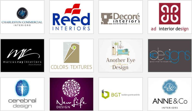
Image Source: ZillionDesigns.com
This is one of the first things that you need to focus on in such brand symbols. When it comes to creating an interior company logo, it’s a good idea to choose a classic or solid color combination. You may come across a few sleek and minimalist brand designs that instantly make an impact in black and white or monochromatic tones in red or gold. If you think about it, the interior design logo needs to stand out in all print and digital mediums.
A confusing color palette with bright solids or contrast could end up sending the wrong message to the audience. This may also impact the quality of the design on business cards, stationery, and merchandise such as t-shirts and mugs. By selecting one or two colors for the logo, you can create a timeless symbol that stays relevant for a long time. This does not mean that you should avoid accents or a pop of color to create a distinct interior design icon.
Hues of pale pink, purple, or blues can complement neutrals and dark earthy tones as well. The logo could instantly catch the eye of the visitor on social media pages, headers and websites too. You also need to keep branding materials such as flyers, brochures, and banners in mind.
Sleek Monograms or Lettermarks
Image Source: ZillionDesigns.com
It is another factor that could help you demystify interior design logo design. Monograms or letter marks can help designers and business owners build recognition and express creativity as well. This can help you create a sleek and versatile design that tells the audience about what you have to offer. Mostly, initials or monograms highlight the name of the professional. They can be combined with a wordmark or a meaningful icon.
If you think about it, you can make a strong first impression with clear-cut and bold typography for letter marks. Pick modern and Sans Serif font styles that appear visible and prominent in different sizes. You can also opt for a creative script or calligraphic typeface to add elegance or sophistication to the design.
In the end, it’s about designing a unique interior design logo that helps attract potential clients. Sleek monograms can be easily added to websites with minimal upgrades. You also don’t have to worry about making a lot of changes to the favicon.
Script or Calligraphy Styles
Image Source: Dribbble.com/Andy Luce
Sometimes, a simple wordmark in a flowing script can work very well for interior design branding. The calligraphy style can make the name of the company or designer grab attention on business cards and stationery as well. In this industry, you may find a lot of contemporary and clean fonts being used in logos. With a custom script, it’s easier to create a distinct and unique interior design logo. It also allows brand owners to showcase their expertise.
Now, a few people may find it challenging to understand the wordmark or get a clear idea of what it says. To make sure that your audience or potential clients immediately see the name, it’s a good idea to opt for styles that can be displayed everywhere. This way, you can maintain simplicity in the design and make it easier for people to identify it across print and digital mediums.
Take a look at the interior design logo above. The wordmark is in a free-flowing script and can instantly bring out positive feelings within the audience. It can also be easily recognized for its minimalist design that makes a lasting impact on the viewer.
Versatility

Image Source: Dribbble.com/Hristijan Eftimov
This is a very important element that you should consider for such brand symbols. Graphic designers or business owners need to focus on creating icons that are versatile and can adapt to different platforms easily. It has to be used for both internal and external branding. This means that an interior design logo appears on letterheads, email signatures or templates, merchandise, flyers, and on display in the workspace.
If the symbol is versatile, it can work well with any medium and look appealing against various backgrounds. So you need to pay attention to the versatility of the interior design brand logo. This can also help you save money on creating different versions of the symbol. Whether you are using a DIY tool or collaborating with a professional designer, you can get variations of the logo for the favicon, social media accounts, or posters.
These are mostly included in the deliverables and require a one-time payment. In the end, a versatile icon helps lower design and branding costs, and create familiarity among potential clients.
Digital-First Brand Design
Image Source: ZillionDesigns.com
When designing an interior design company logo, professionals and business owners need to consider digital mediums before anything else. In this day and age, most people search for businesses online. People are likely to look up the website or find the listing on Google. They will decide to work with brands based on their digital presence. So it’s important to add elements in the logo design that connect with the audience on such platforms.
For instance, an abstract icon or geometric shape can catch the eye of visitors in a social media profile photo or header. Similarly for the website, you need a logo that conveys the right message from the first look. It should be easy to recognize or identify and represent the niche as well. This is why minimalist logo designs work very well in this industry.
They can adapt to different devices and screen resolutions quickly. With a digital-first brand logo for your interior design business, you don’t have to think about revamping or recreating it after a few years. It could last for a long time and help you expand your business globally too.
Conclusion
Creating an impressive interior design logo can be a bit tricky in the beginning. We have demystified a few important elements of such brand symbols to help you get an idea of what works. Make sure that you focus on the factors above so you can design an attractive and memorable interior design logo design. Before you start working on it, brainstorm ideas and list down the styles or categories that you want to choose for the brand symbol. This way, you can pick the right colors, fonts, and typography that reflect the unique factor of your business closely.
