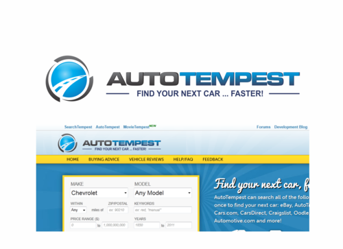
AutoTempest.com website logo
AutoTempest
|
Contest Holder
ATNathan
?
Last Logged in : 4334days12hrs ago |
Concepts Submitted
68 |
Guaranteed Prize
300 |
Winner(s) | A Logo, Monogram, or Icon |
|
Live Project
Deciding
Project Finalized


Creative Brief
AutoTempest.com website logo
AutoTempest
Find your next car... faster!
Yes
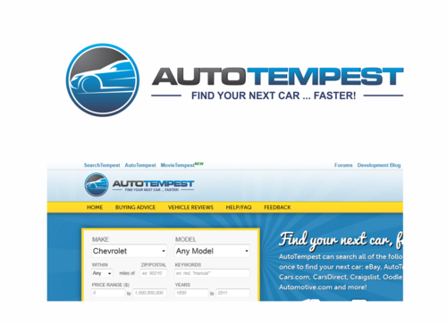
This logo is for the new website design of www.autotempest.com. See a screenshot of the new site design, including placeholder logo here: http://www.tempestblog.com/wp-content/uploads/2011/08/autotempest_teaser.png
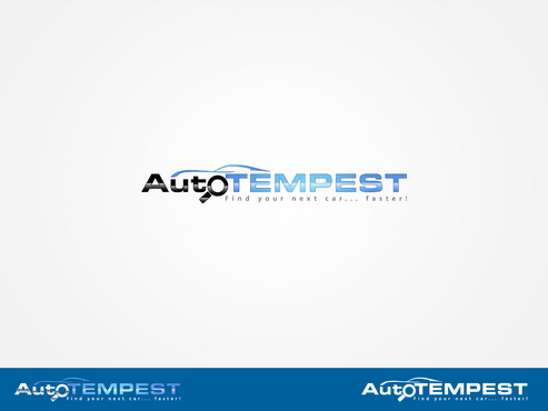
What we're looking to replace/improve is the magnifying glass+car + autoTEMPEST text in the light blue section at the top.
Automotive
Symbolic
![]()
Clean/Simple
Modern
Industry Oriented
High Tech
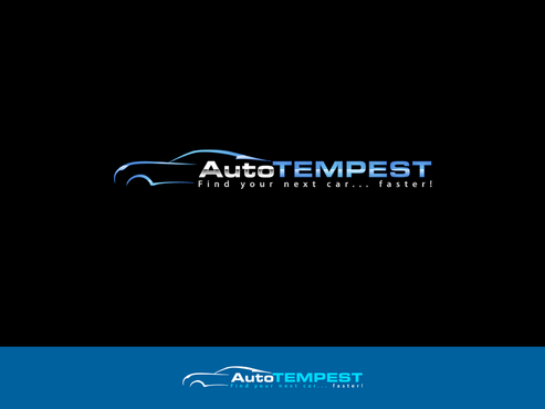
See the screenshot of our existing site design and placeholder logo: http://www.tempestblog.com/wp-content/uploads/2011/08/autotempest_teaser.png. For the text, blue and grey similar to what we have there now is a must. Entire logo can stick to blues and greys, or other colors could be added, as long as they match the site design. We also need a version that will work on a dark background. (To take the place of the logo here: http://static.autotempest.com/images/results_test_header.png.) For reference, that starburst background image it's going to go on top of is here: http://static.autotempest.com/images/body-bg-sun.jpg
not sure
One thought we had that would convey 'tempest' while remaining clean and simple would be an 'eye of the storm' symbol similar to the ones shown here: http://www.tempest.ca/images/tempest_logo.jpg. (Potentially with that same car logo we have now in the middle.) Obviously could be styled differently, orientation changed (perhaps vertical to fit where the current magnifying glass is), etc.
That's just one option though. I'm open to all designs that fit well in that space. Feel free to tweak or completely modify the text too; different fonts and capitalizations are fine (AutoTempest, AUTOTEMPEST, autoTEMPEST, etc. The only one I'd avoid is Autotempest.) We like the current text though, so changes there aren't necessary unless you feel it improves the overall look.
Related Contests