band logo kansascity
Samsara
|
Contest Holder
rebeccazimm
?
Last Logged in : 4845days21hrs ago |
Concepts Submitted
11 |
Guaranteed Prize
200 |
Winner(s) | A Logo, Monogram, or Icon |
|
Live Project
Deciding
Project Finalized


Creative Brief
band logo kansascity
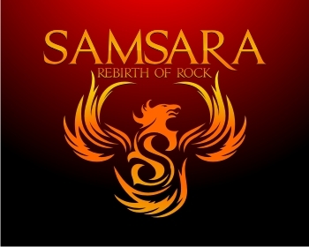
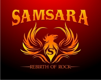
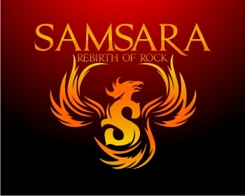
Samsara
rebirth of rock
No
the pheonix bird is a chosen icon representing rising up from the ashes(second chance)
band edgey rock
inspiration
Music
Illustrative
![]()
Masculine
Modern
Cutting-edge
Elaborate
Professional
Casual
High Tech
Rustic
we like the red & orange usually seen with the pheonix bird..but are open for suggestions
not sure
pheonix bird incorporated possibly
this is a heavy metal band
Related Contests